

Overview
With COVID-19 changing the way society operates in 2020-2021, many industries are relying on online sales to stay afloat. Zara, one of the largest clothing retailers, is also seeing a significant shift in consumers contributing to their online sales, but users have expressed frustration with using the site.
Using standard usability testing principles and design thinking, I evaluated Zara’s UK website to find and amend usability issues for a more efficient, effective, and satisfactory experience.
The Challenge
While Zara claims to put customers at the centre of their brand, users online have expressed difficulties and issues in the usability of Zara’s site, including many of my friends. This prompted me to evaluate Zara’s web presence and find a way to improve their site while working within their established brand and creative direction.
The Solution
I conducted a usability test compliant with the Common Industry Format (CIF) methodology with 6 users and performed a redesign of the Zara UK website after identifying key usability issues and formulating recommendations to enhance the site’s ease of use when searching for and purchasing clothing items.
In addition, I created a style guide, task analysis, and class diagram for the redesigned site.
Company
Conceptual Project
Project Duration
10 weeks
Role
User interface design, user research, usability testing & analysis, heuristic evaluation, information architecture, task analysis, object-oriented analysis, and prototyping
Tools
Adobe XD, Miro, Zoom
Methodology
I followed the CIF methodology for the usability test and used standard metrics to measure efficiency, effectiveness, and satisfaction.
In addition, I incorporated qualitative experimental design components such as the thinking aloud protocol, emotional interpretation, and a post-test interview. These components helped me gain deeper insights to sufficiently achieve my research goals.
I also used the Hasso-Plattner Institute of Design at Stanford’s design thinking process consisting of research, define/analysis, ideation, prototyping, and testing & evaluation for the redesign portion of this project.
Market Research
Heuristic Evaluation
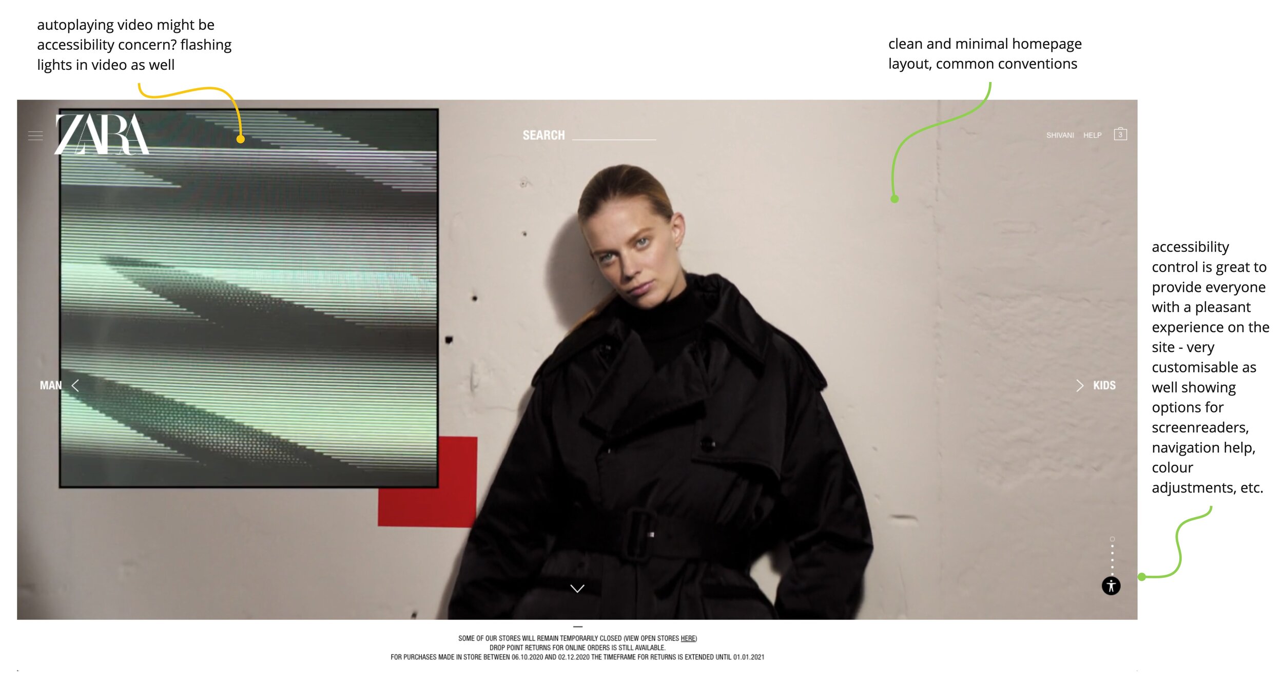
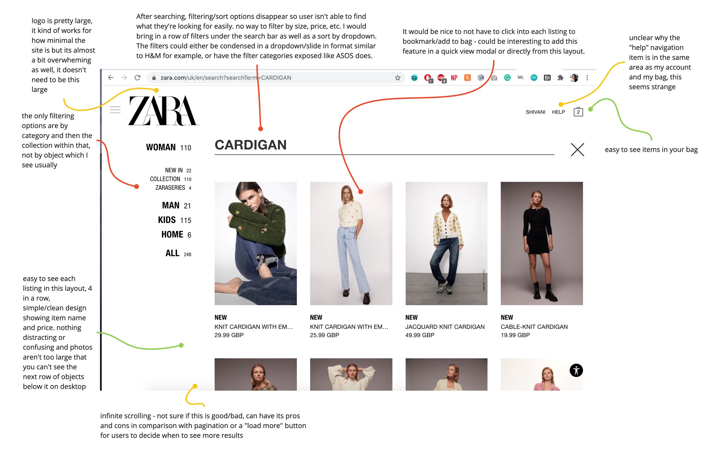
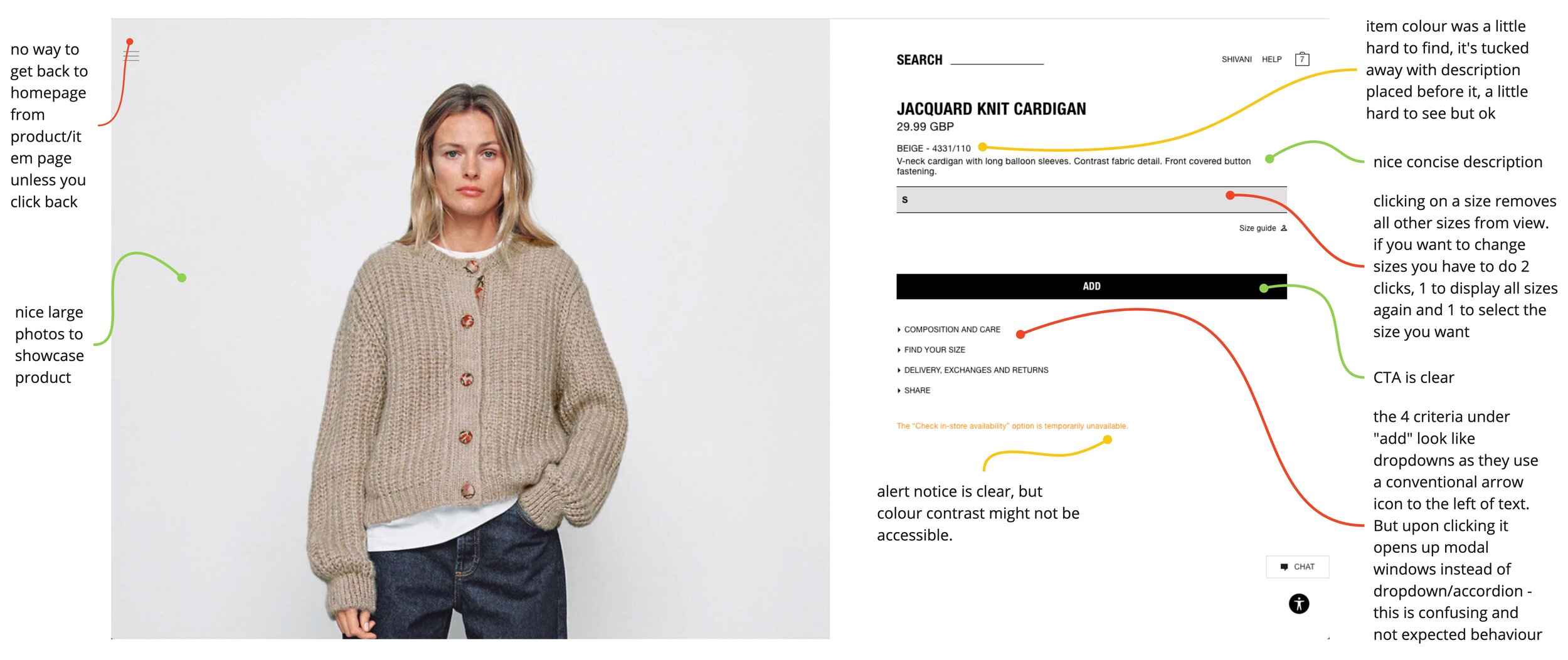
Before usability testing, I conducted a heuristic evaluation of the current Zara UK site to find usability issues. I focused on the main functionality, layout, UI components, and content a user will interact with when searching for clothing and adding items to the shopping bag.
This evaluation was a good exercise in unveiling possible usability issues that users could come across during testing and allowed me to empathise with users while also offering a designer’s perspective.

Research & Task Goals
Based on market research, I learned that most users desire efficient search and navigation from online retailers. This informed the research goals that this usability test will set out to achieve.
The goals align with the standard usability measures of efficiency, effectiveness, and satisfaction, and allowed me to keep top of mind how shoppers are using Zara when searching for items, finding item information, and adding items to their shopping bag throughout the course of the testing and evaluation.
I selected tasks that explored non-core functionalities to focus on less frequently used features that need greater consideration for a smooth online shopping experience on Zara’s site. After fine-tuning the scenarios and tasks based on a pilot study and the insights from the participant information questionnaire, I created tasks that explored users finding product information and searching with specifications in mind.
Having an understanding of the research goals and participant insights allowed me to make informed judgements on what the usability testing tasks should be.
Participant Recruitment
Keeping in line with Zara’s target demographics of 18-35-year-olds who are price conscious, I sent an information questionnaire to 6 users to gain more insights on their clothing shopping habits to see whether they would be suitable for this usability test.
I evaluated the questionnaire findings to ensure the users were representative of Zara’s target market and recruited these 6 participants.
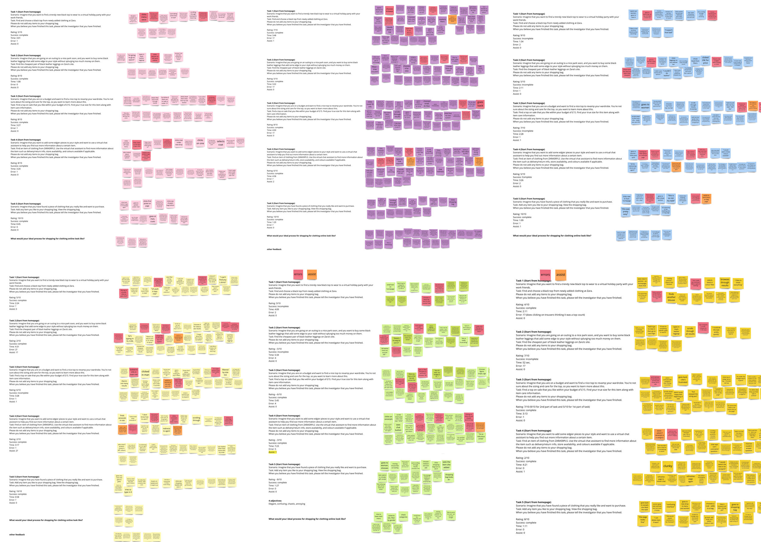
Usability Testing
Materials
I produced many standard documents to aid me in preparation for and during usability testing. This includes:
Participant Recruitment Advertisement
Participant Information Sheet & Informed Consent Form
Participant Information Questionnaire
Usability Testing Script
Task Instruction Sheets
Observation Sheets
Post-Test Questionnaire
Metrics
The standard CIF metrics to assess efficiency, effectiveness, and satisfaction along with a few additional metrics to assess usability were used. These include:
Completion rate per task
Time on task
Error count per task
Assist count per task
Satisfaction rating per task
System Usability Scale (SUS) score
Net Promoter Score (NPS)
UI Design Assessment
Emotional interpretation
Procedure
The following steps make up the procedure for the usability testing:
Recruiting Participants
Obtaining Participant Informed Consent
Obtaining Participant Information & Screening Participants
Setting up Meeting Time
Sending Preparatory Test Materials (Task sheet, Zara UK website URL, video conference link)
Conducting the Usability Test (using Usability Testing Script and Observation Sheets)
Post-Test Interview
Post-Test Questionnaire
Findings
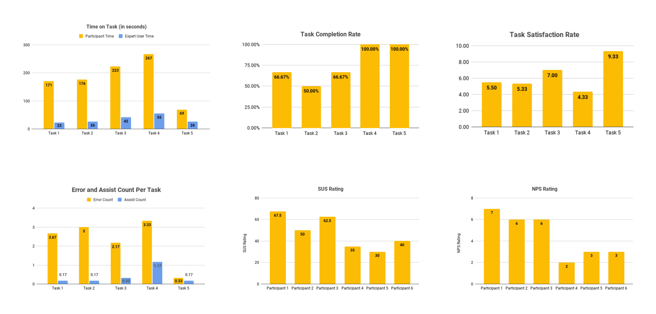
Overall, the quantitative results from the usability testing show poor usability of the Zara UK site. Below are some of the key findings such as a low satisfaction rate, low completion rate, and high amount of time per task that highlight the usability issues on the site.
In addition, the SUS score was labelled “awful” the NPS rating was a negative score signifying that users are having a difficult time with the site’s usability. Breaking down these metrics and looking at them holistically as a representation of usability provided me with a clear view of the immediacy of improvements needed for Zara’s site.
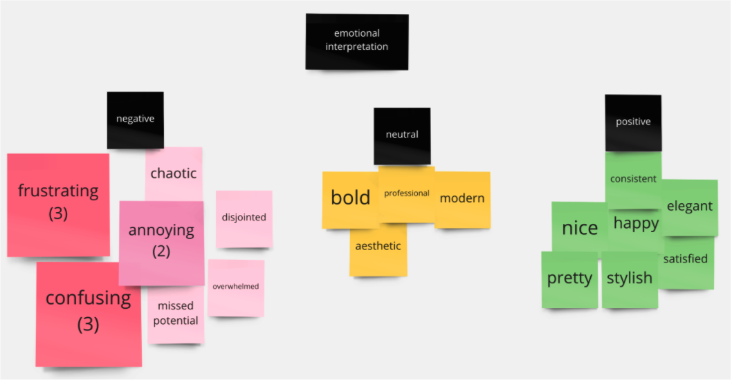
For the qualitative findings, I created a word cloud that visualised the frequency of emotional adjectives users voiced about the Zara website. In addition, I created an affinity map of the verbal feedback from users during usability testing and formed themes around the most common usability issues encountered.
These insights validated the overall frustration and confusion that most users experienced while using the site.
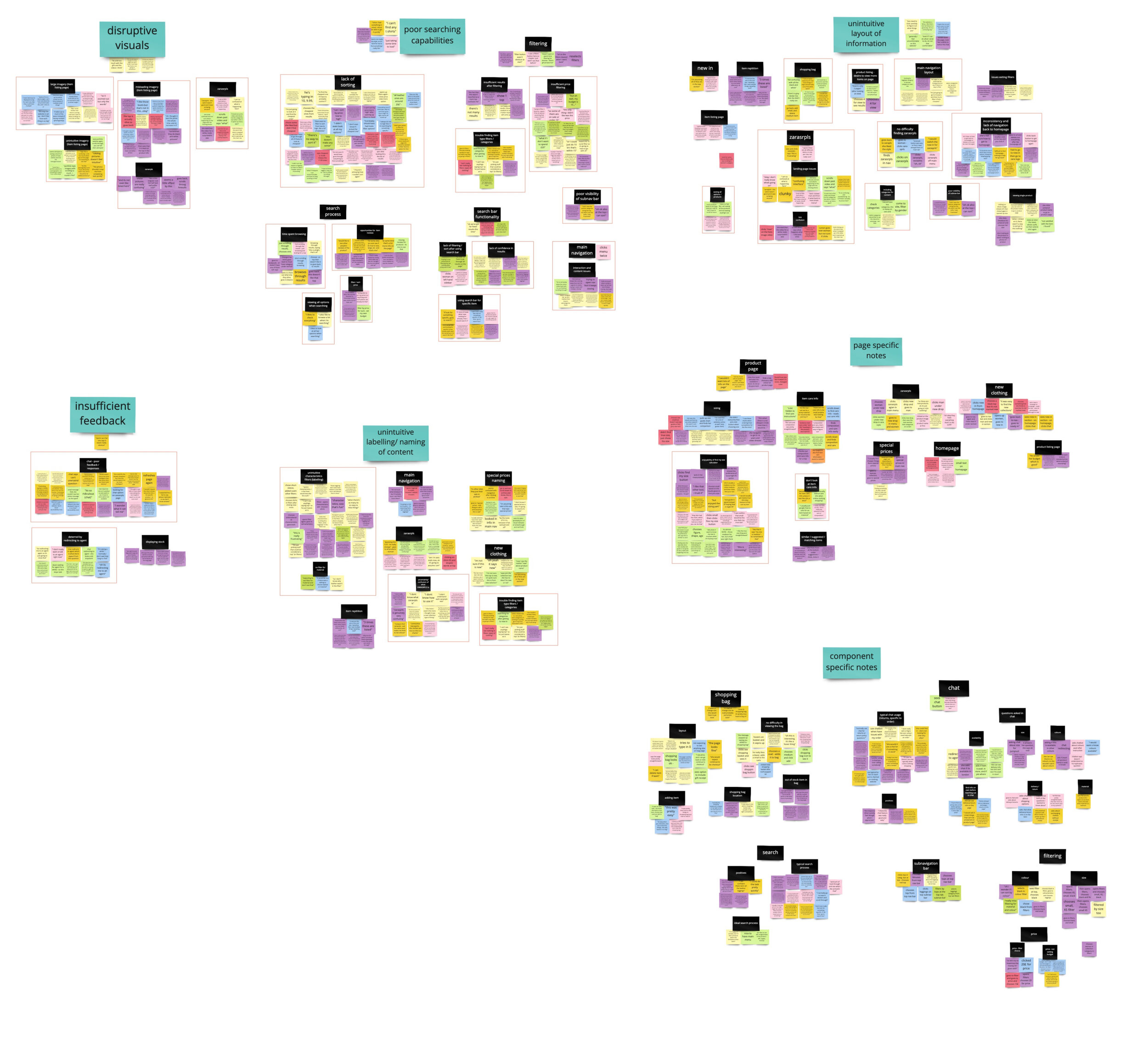
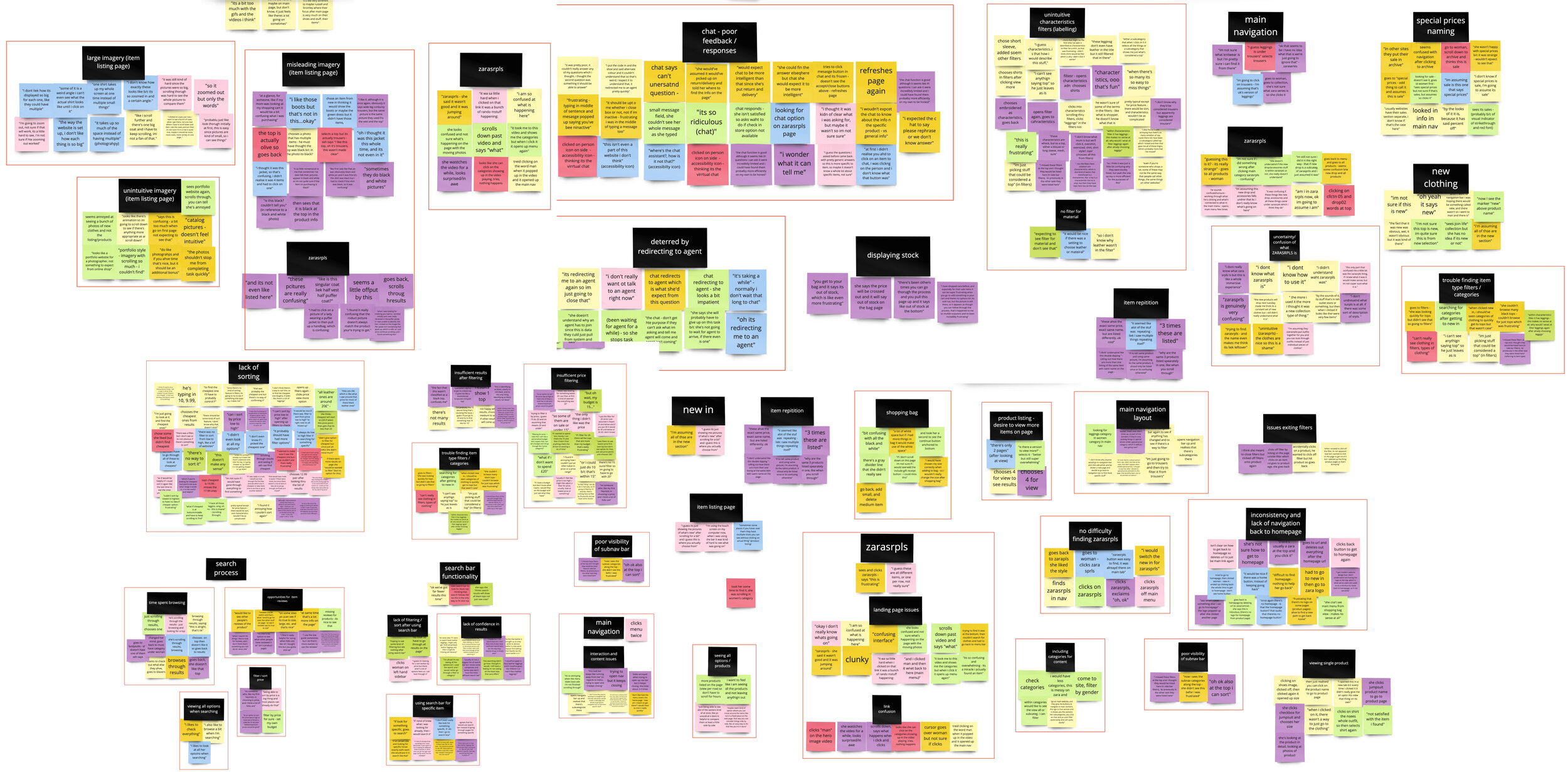
Usability Issues
Based on the quantitative and qualitative findings, I identified 5 key issues that affected all participants:
Disruptive visuals
Insufficient assistance
Poor searching capabilities
Unintuitive layout of information
Unintuitive labelling of content
The table describes each issue, the page type/UI affected by it, issue frequency, and the issue severity. I assigned standard severity levels of critical, serious, and minor to each issue instance.
This helped me evaluate the immediacy of the issues and prioritise which issues to tackle first.
User Persona
To put the data into a more tangible perspective, I created a user persona. This allowed me to see a holistic picture of the target user, and evaluate their goals, frustrations, behaviours, motivations, and personality based on the usability testing findings.
Redesign Recommendations
I provided redesign recommendations for all the critical usability issues, which strive to keep the clean, minimal aesthetic of Zara’s site while optimising pages and components to be more intuitive and usable.
Because the redesign recommendations are directly correlated with the user data, I felt confident about the changes necessary for each UI feature to make the site more user-friendly.
Prototyping
Using the recommendations, the Zara site was redesigned to amend the most critical usability issues. Standard website usability and design principles such as colour, scale, typography, imagery, hierarchy, consistency, gestalt principles, navigation, and accessibility were used to inform design decisions.
I implemented changes to the product listing page, product page, search page, search results page, ZARA SRPLS homepage, and ZARA SRPLS product listing page, which is where critical issues were found.
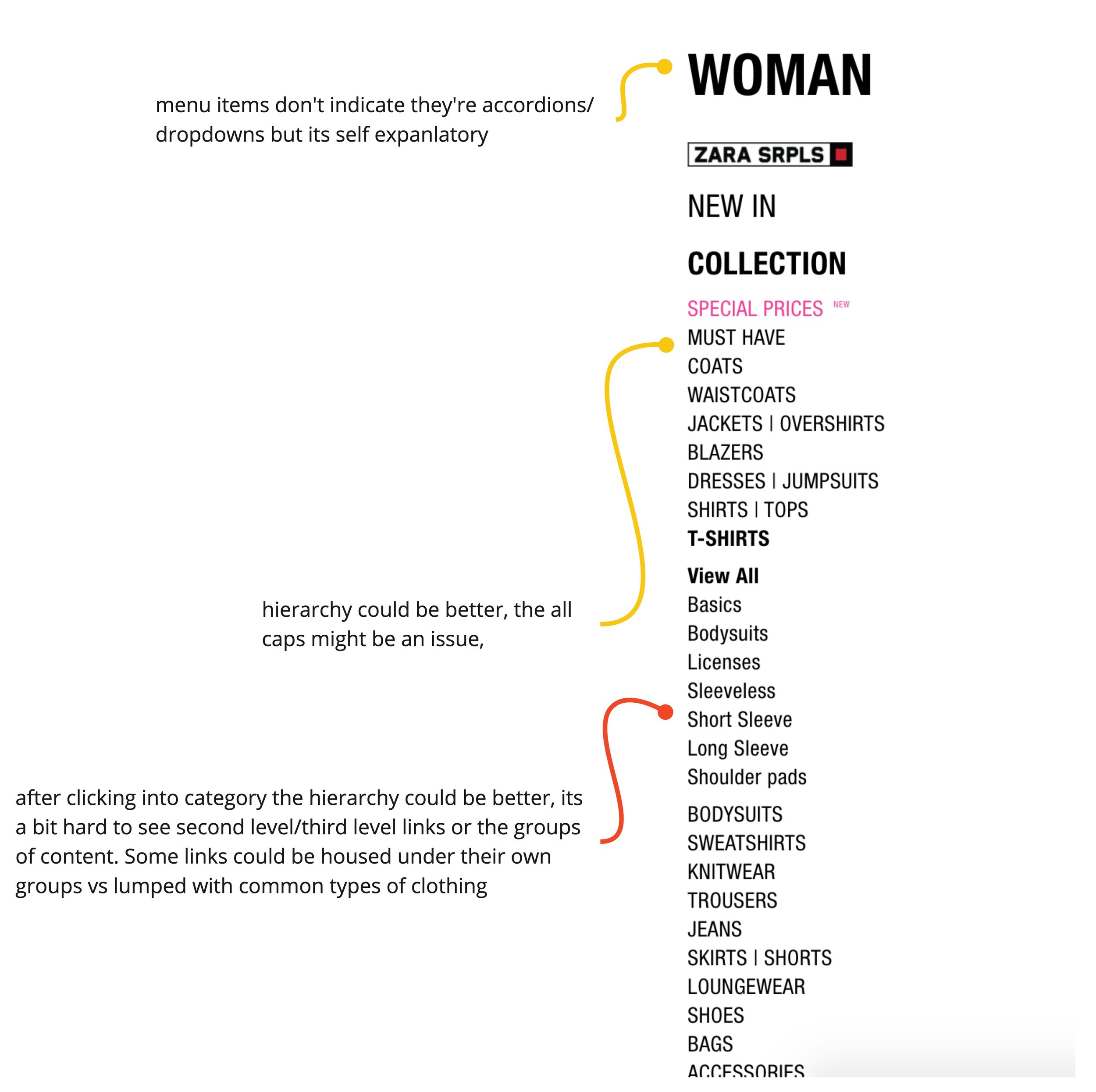
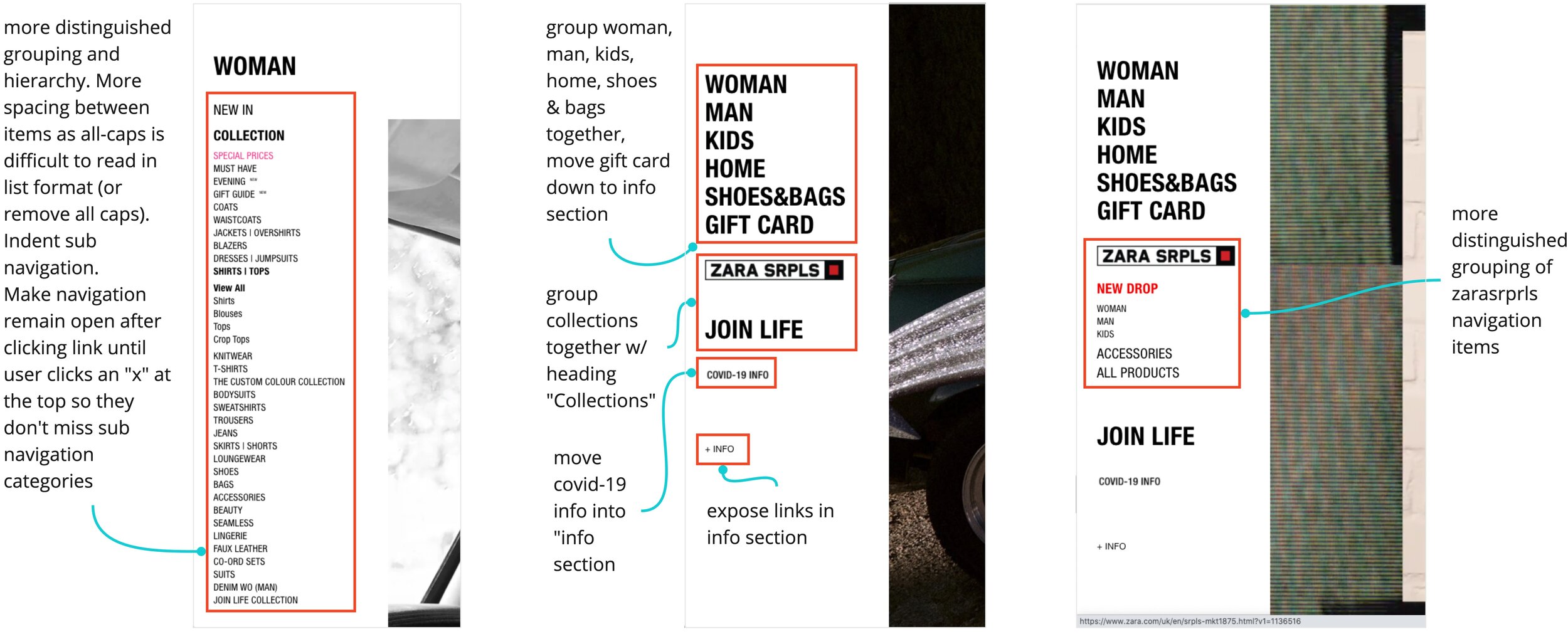
Main Navigation
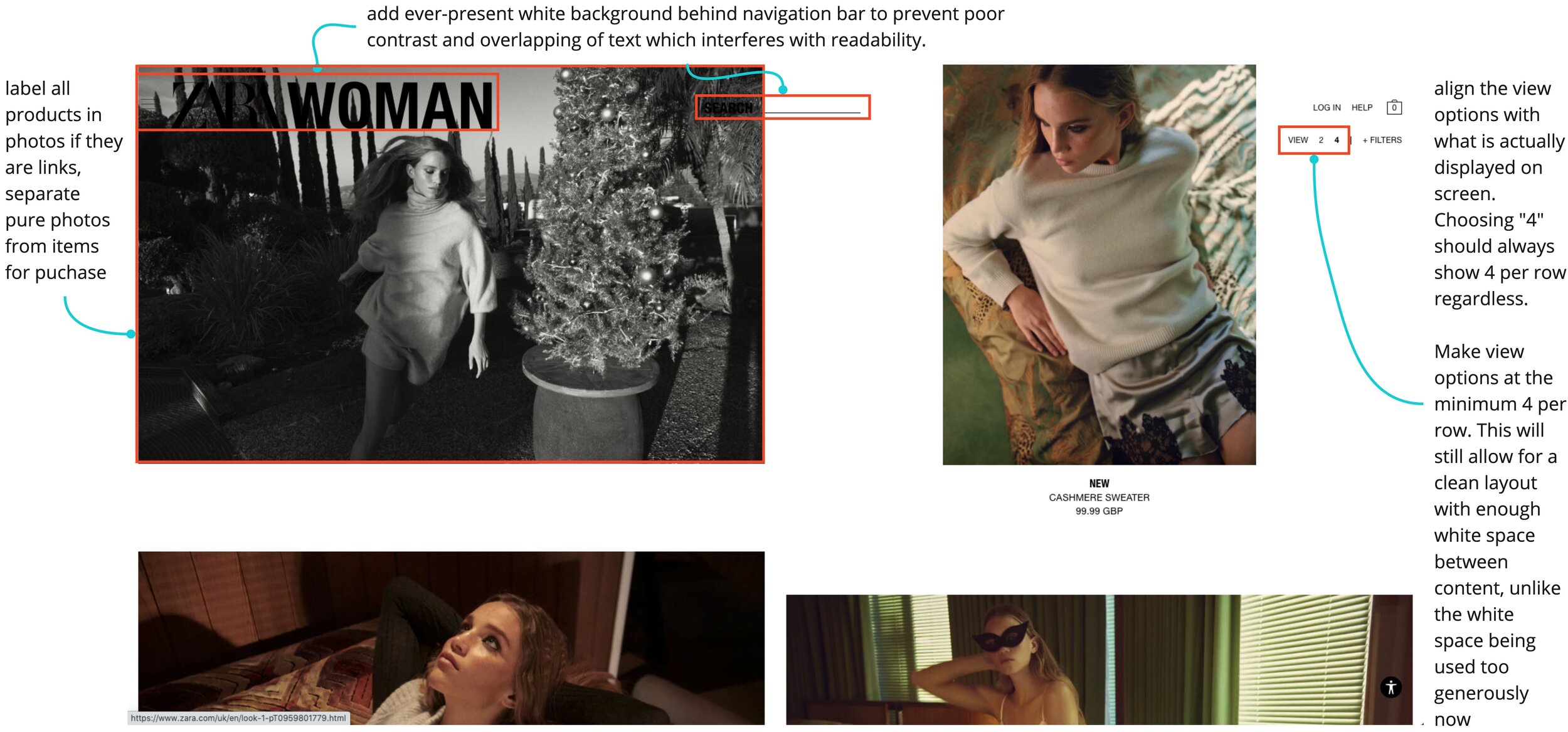
For the main navigation bar on the homepage, I added a black to transparent gradient to make the text more readable to better comply with accessibility standards.
When the main navigation is opened, I added plus and minus icons as a visual indicator for accordions holding all product categories. In addition, I added short descriptions for each clothing collection so users have a better understanding of the collection’s style of clothing.
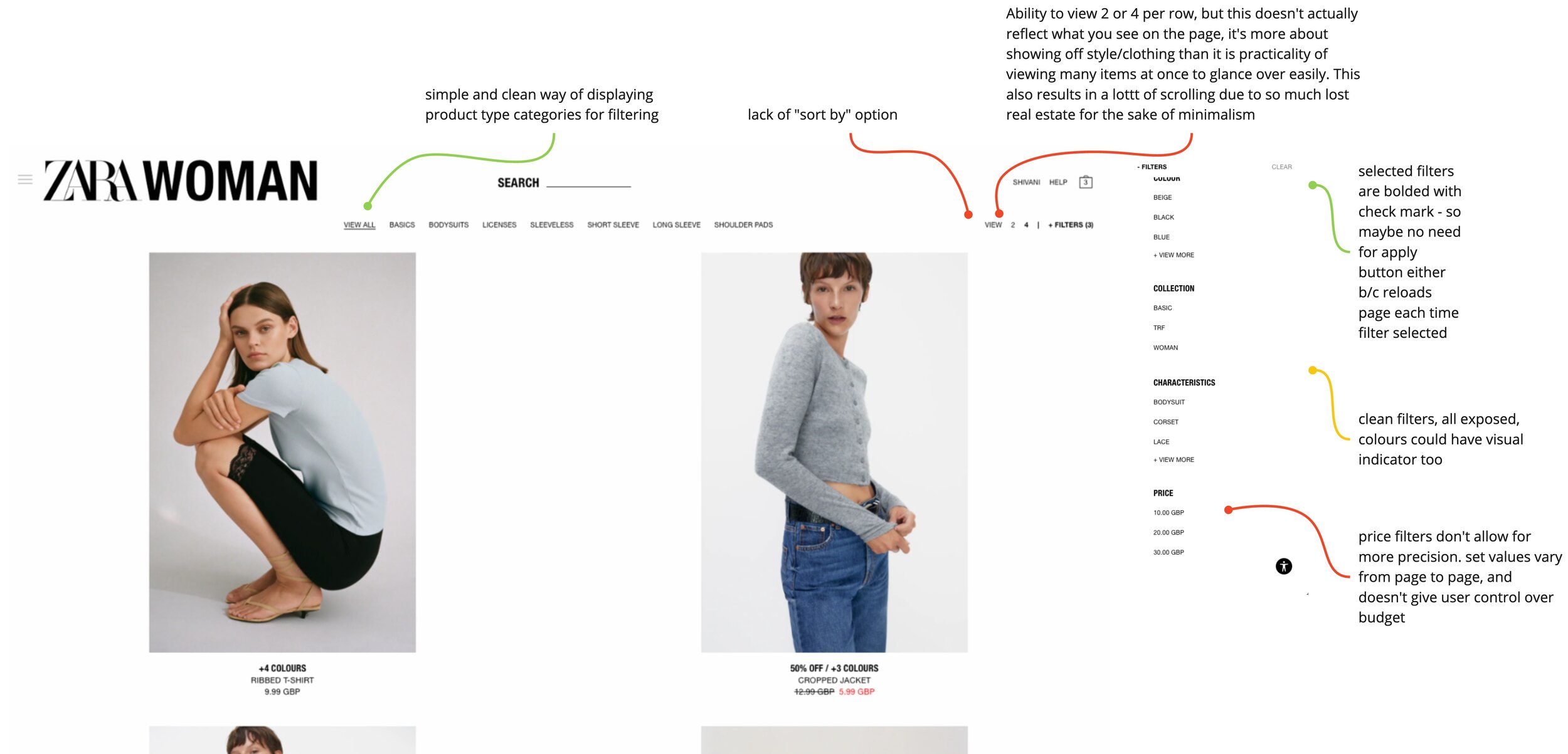
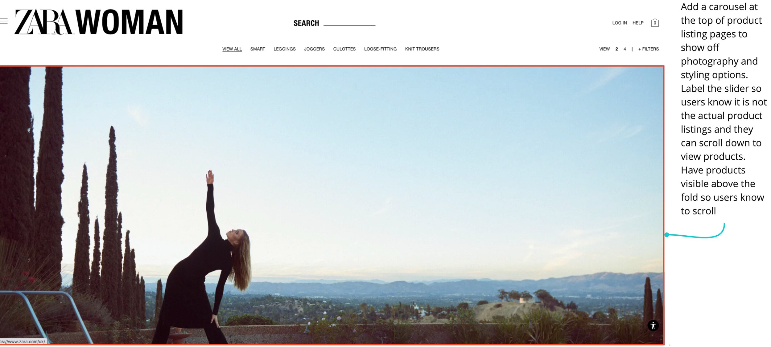
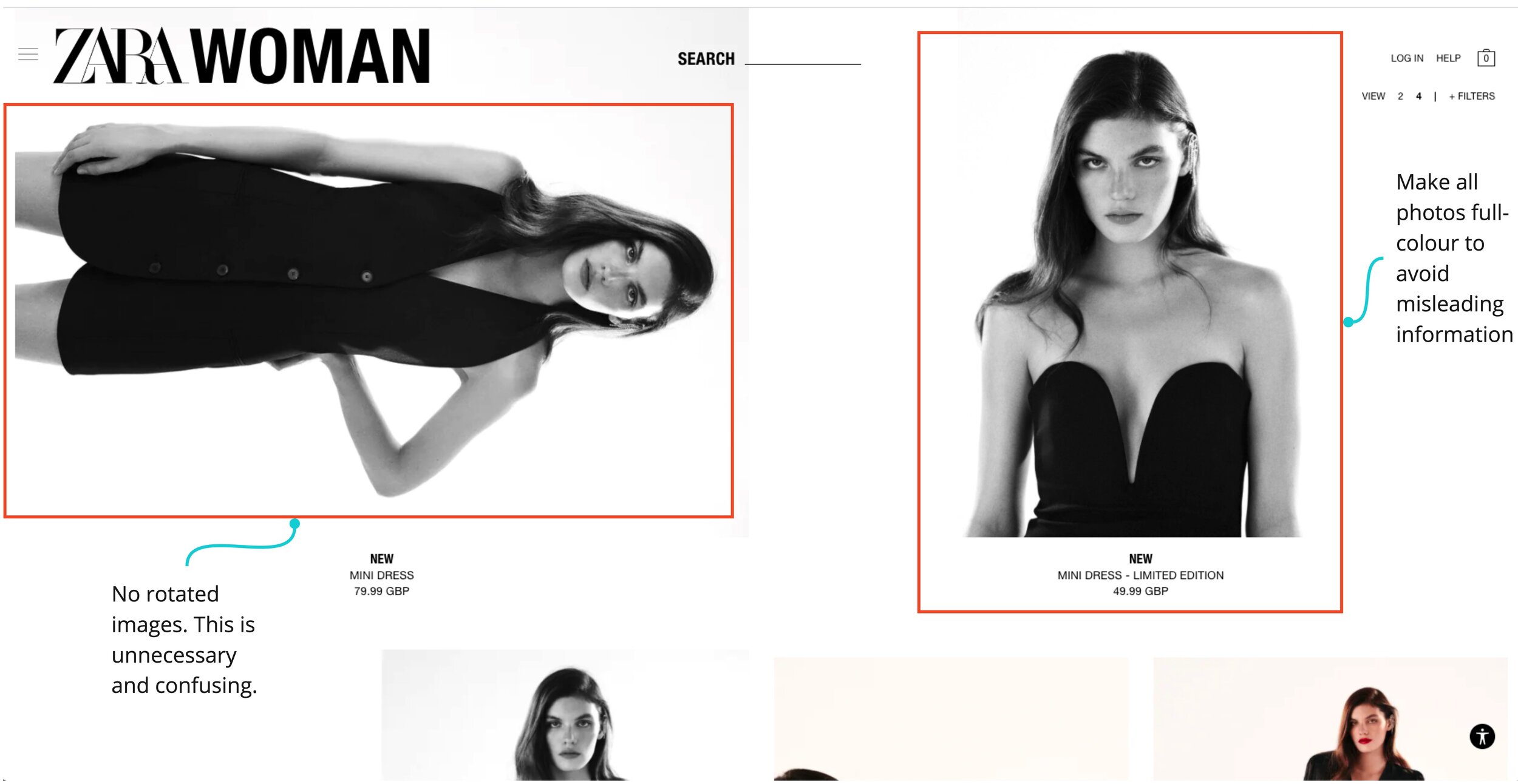
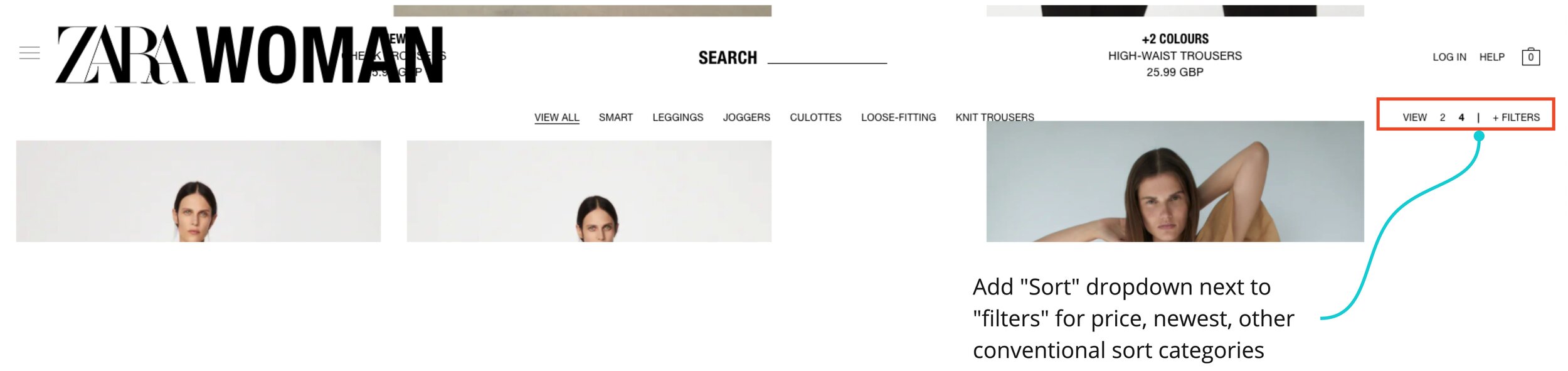
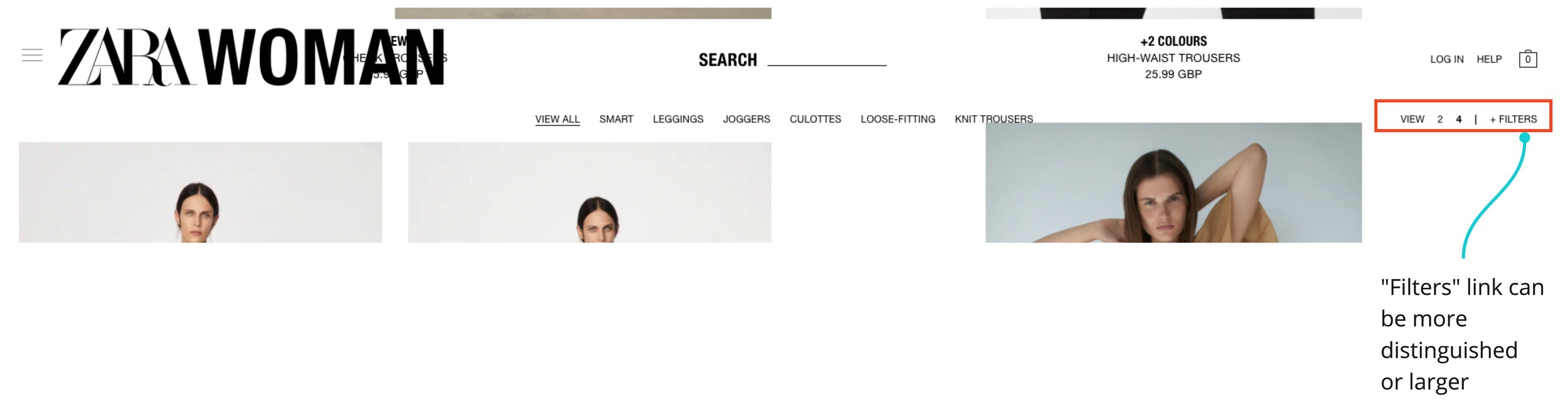
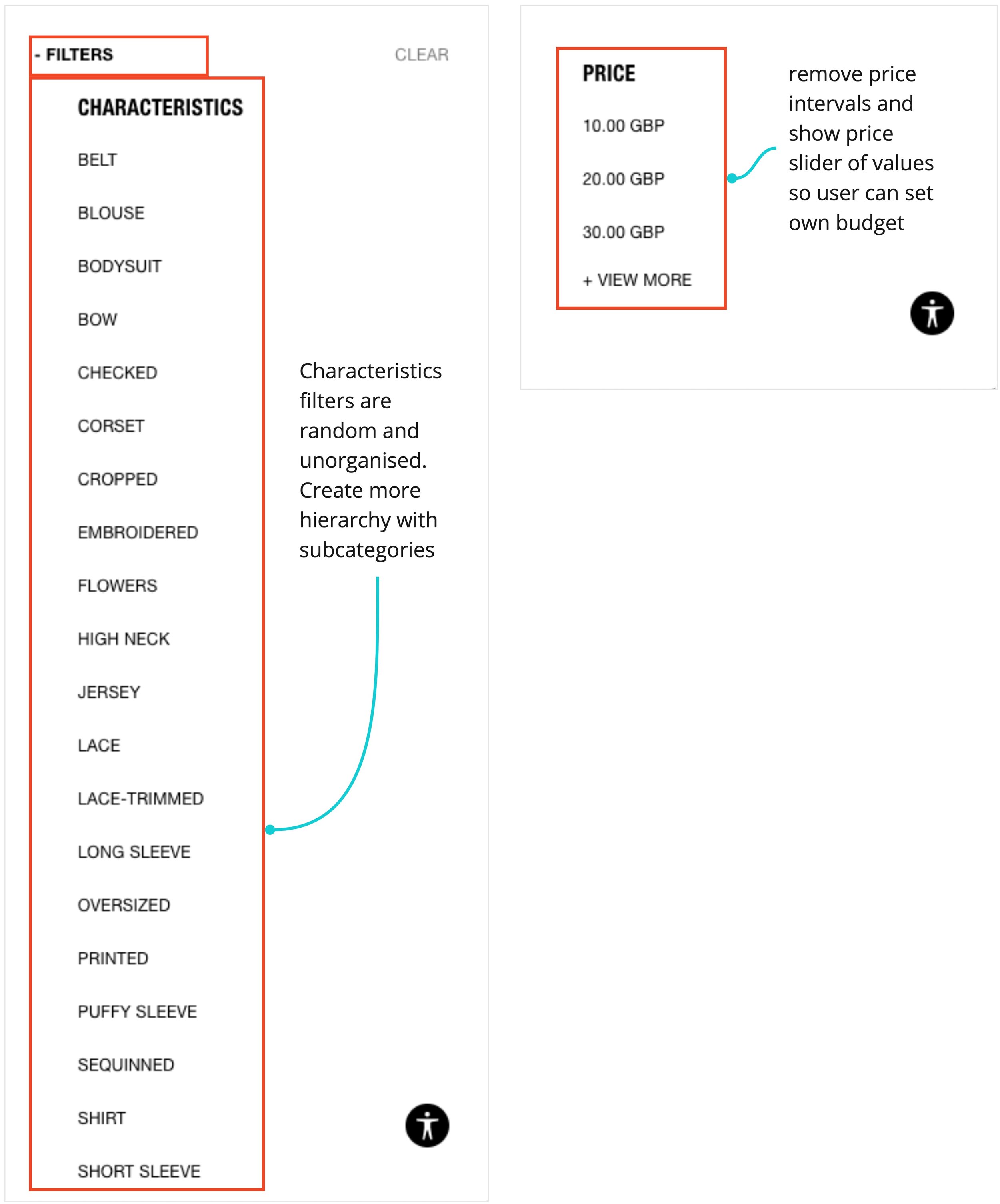
Product Listing Page
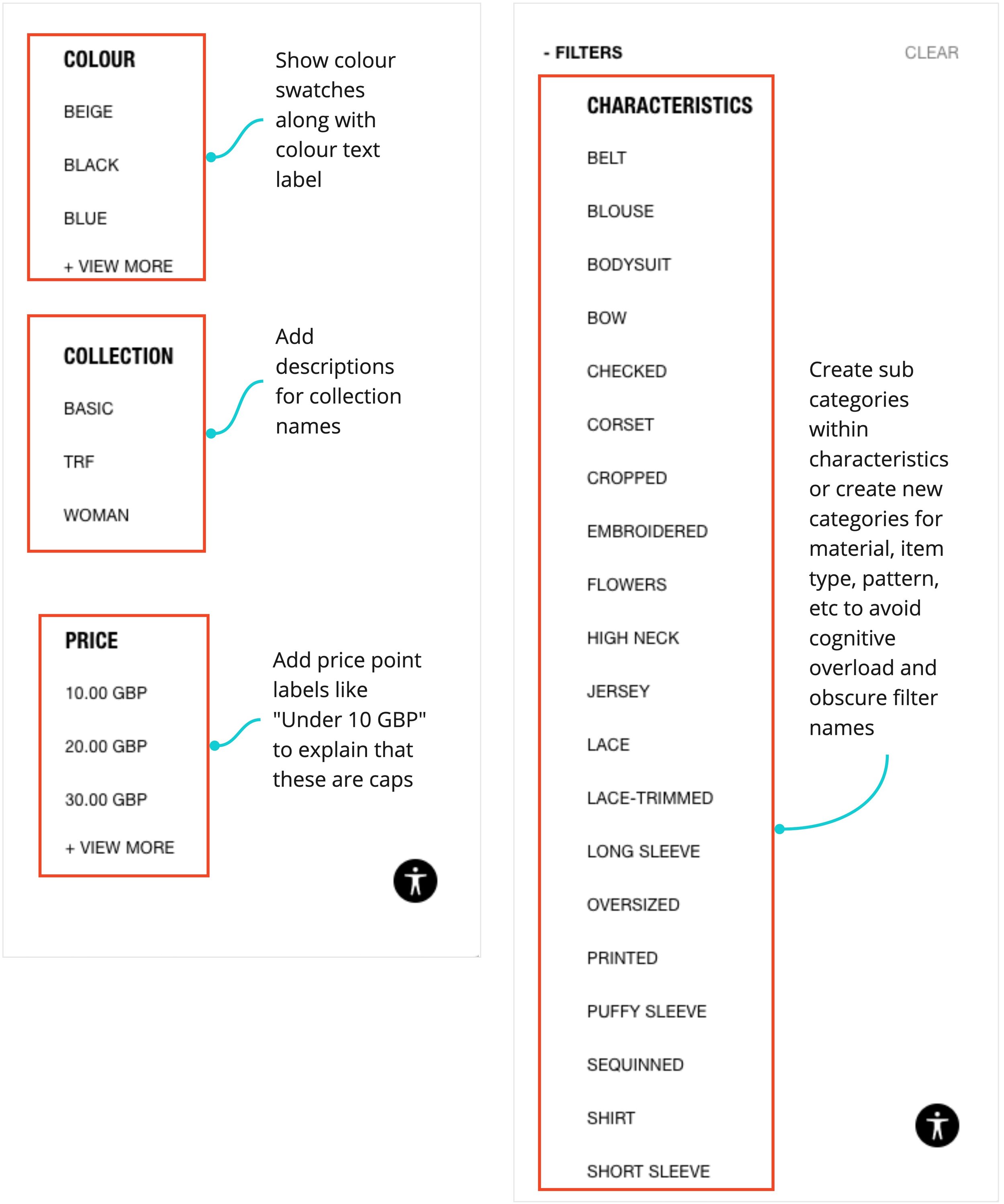
This page houses all products from a product category. I modified the top navigation bar to have the view settings on the left, consistent sub-navigation present for all listing pages, added a sort functionality, and better organised and labelled the filters.
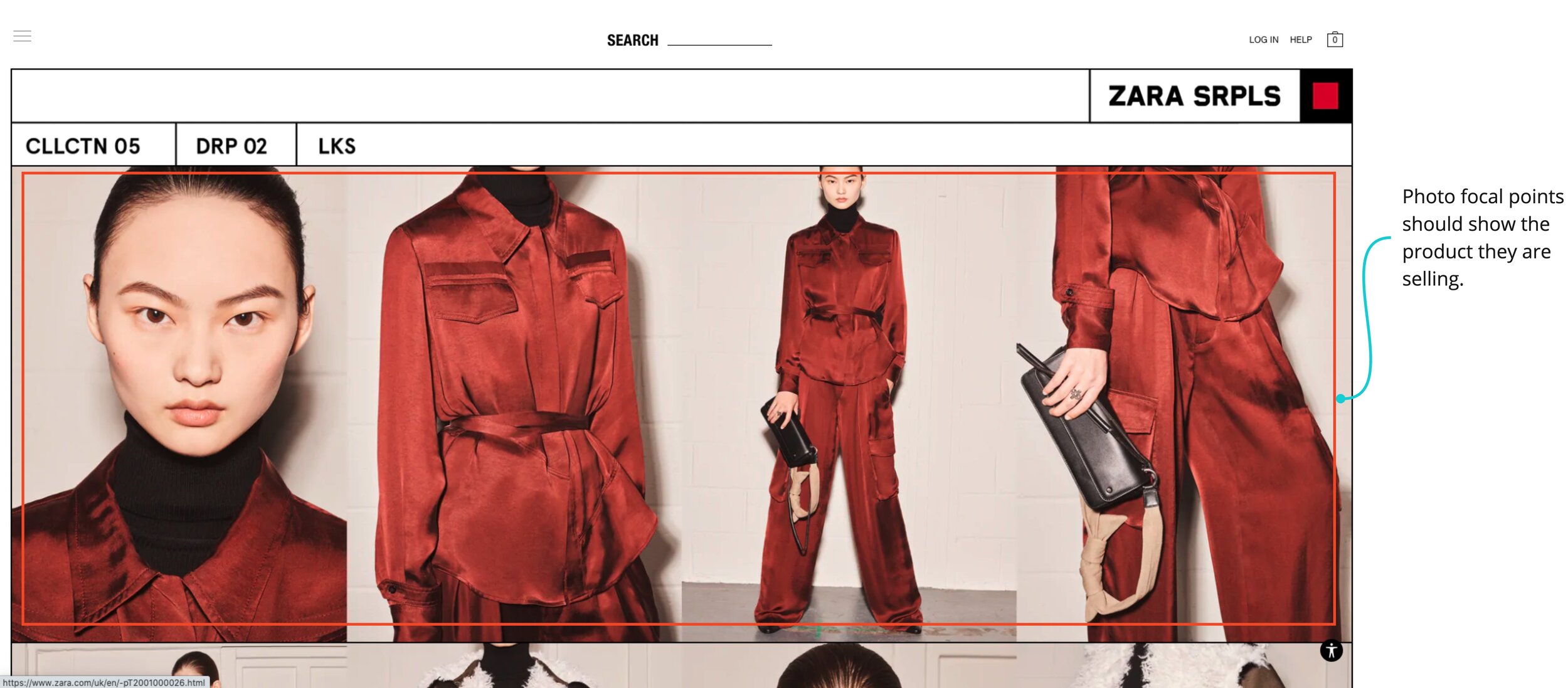
In addition, I added a style lookbook feature to showcase product photography from the respective product category in a much less distracting way.
I also set the default view to 4 items per row and created a more flexible layout that allows for certain products to be featured. In addition, I added product colours, multiple product shots in carousel format, and redesigned the “New” label for products so users can see more information on products easily at a glance.
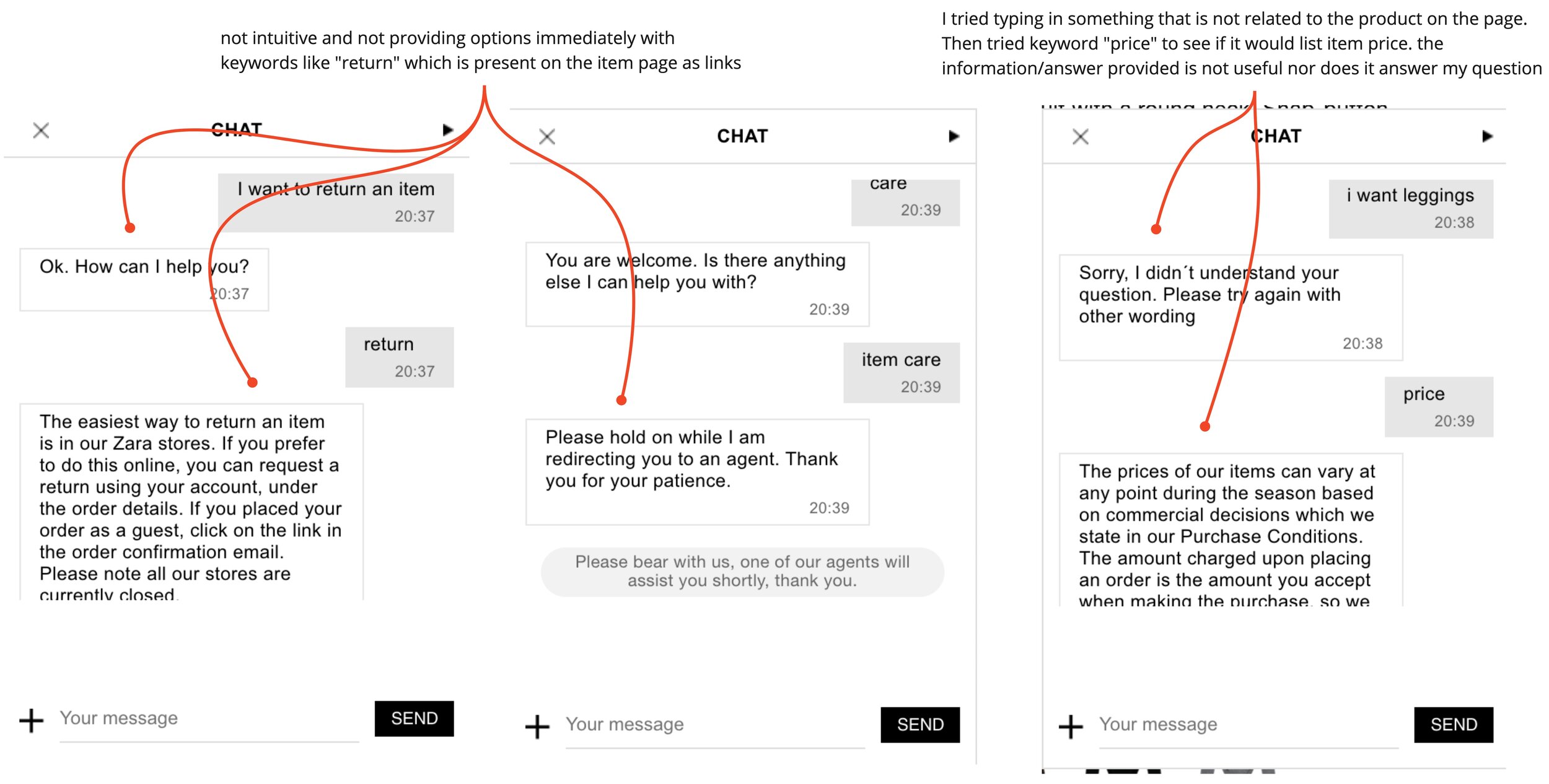
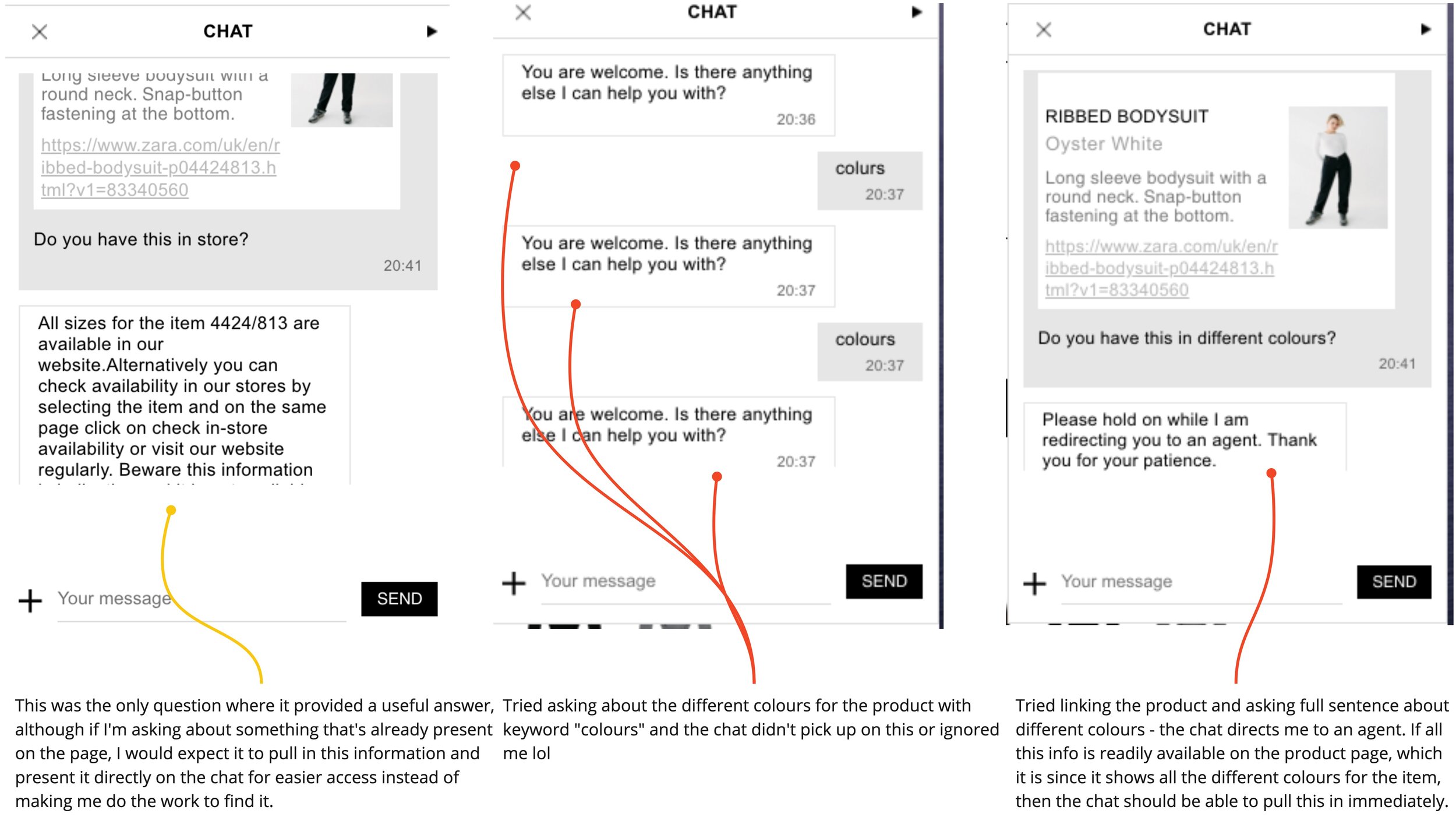
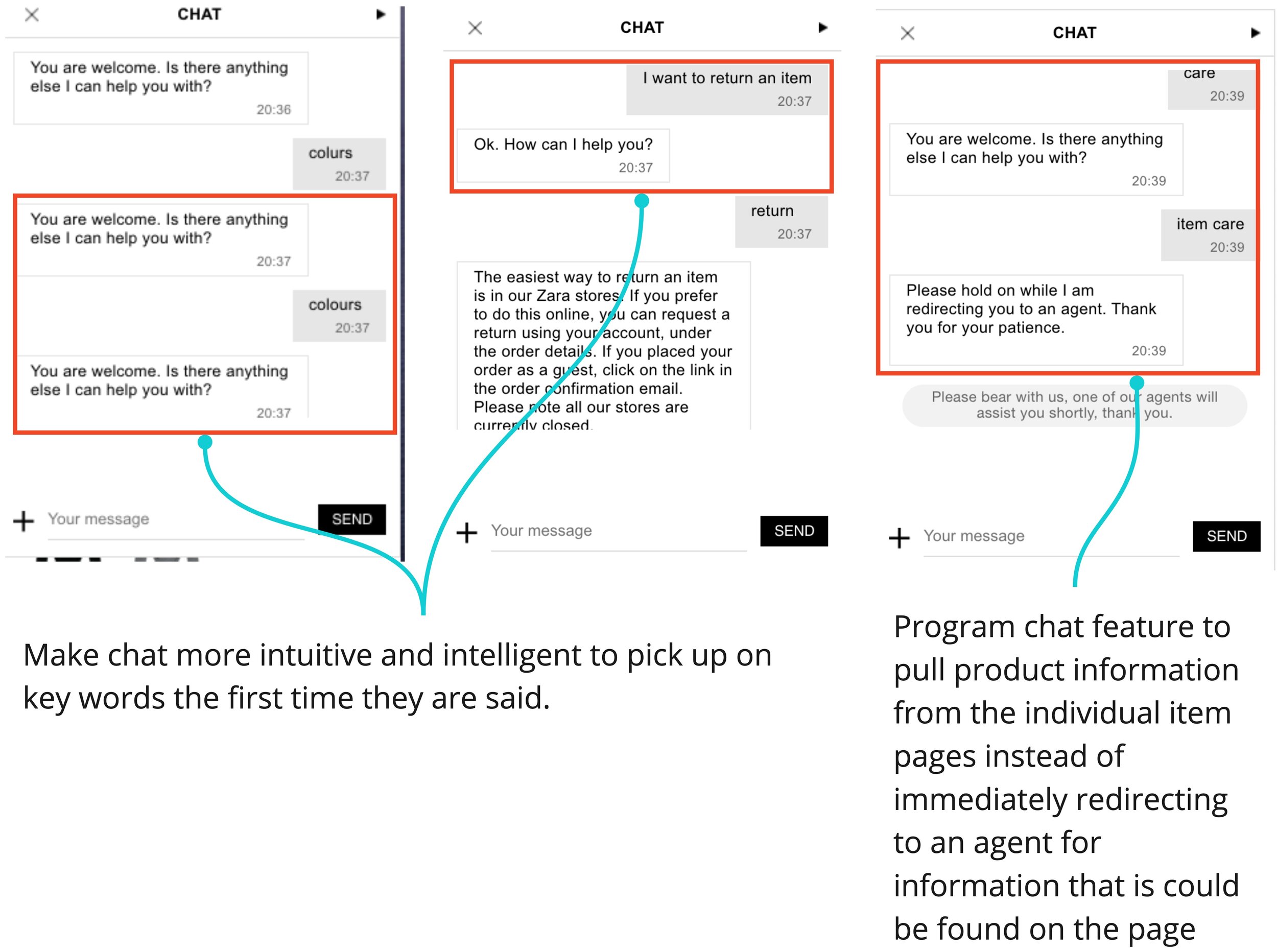
Chat Feature
I made the chat feature more visible and accessible across the whole site, and made the interaction with the chat much more intelligent and intuitive than on the current site by keyword recognition and pulling information from product pages directly instead of immediately connecting the user to an agent as it currently does.
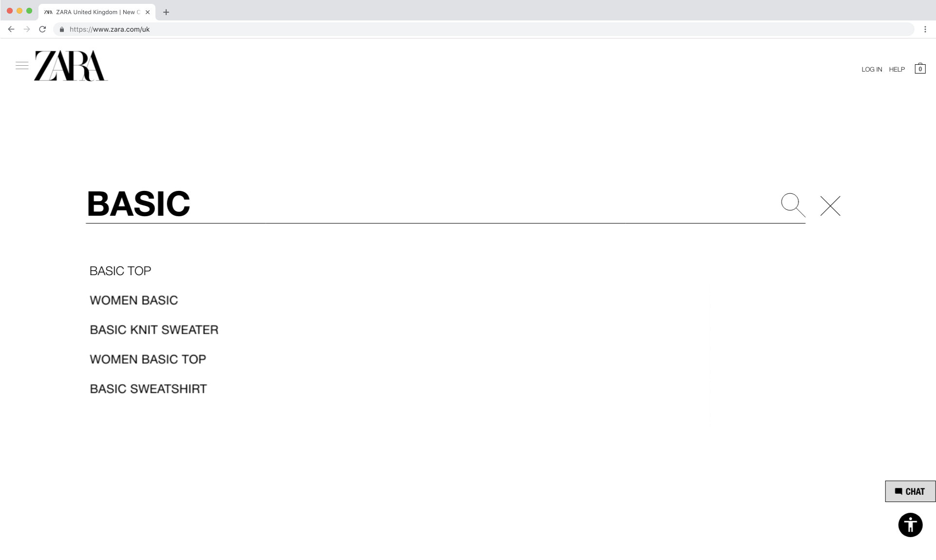
Search & Results Pages
When a user clicks the search bar along the top navigation bar, the search page will open up full screen. This page includes the search input field along with search suggestions for any keyword typed. I added a magnifying glass icon for a clear search action and an “x” button to delete a search.
Once the user searches for an item, they will be taken to a results listing page. I maintained consistency across the site by treating product listing pages the same, and this results page aligns with that. Therefore, users can still sort and filter these results, which is lacking on the current Zara site.
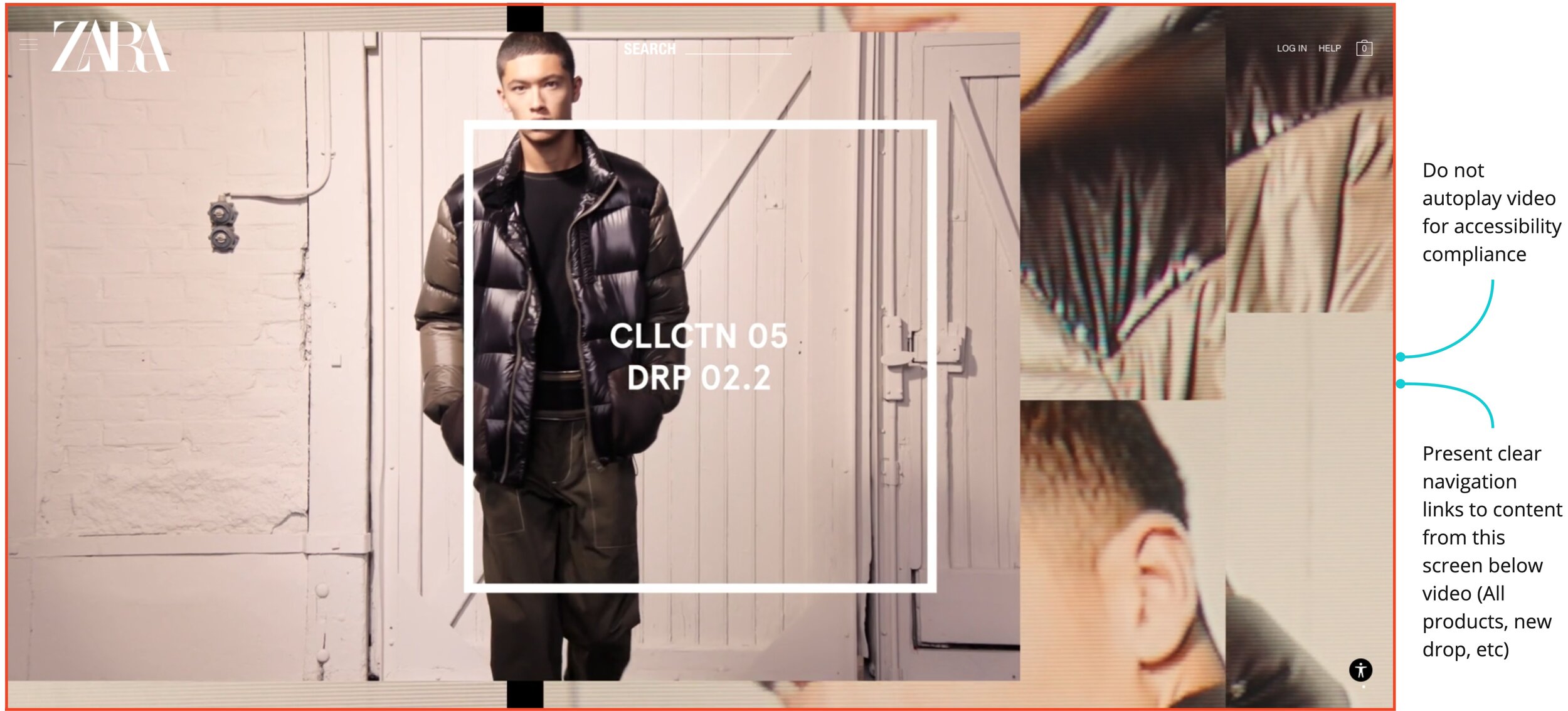
ZARA SRPLS Homepage & Product Listing Page
Since users found it difficult to navigate the ZARA SRPLS pages, added a play/pause button to the hero video to comply with accessibility guidelines. I also added links to the “New Drop” category below the video with links to the three departments.
When the user selects an item within ZARA SRPLS, they will be taken to the product listing page which is styled to match this collection’s unique look and feel. I ensured consistency by including the top navigation bar on this page and styled each product card similarly to the main product listing page items.
Styleguide
With the redesign complete, I compiled the visual styles and UI components that make up the website into a styleguide that creates guidelines around each component’s usage to ensure consistency across the site.
The styleguide was a good lesson in thinking through how I would collaborate with developers and what types of information they would need for each component at a high level.
Models
Hierarchical Task Analysis
To account for all the tasks and subtasks a user will take within the redesigned Zara site, I created an HTA that maps out the various interactions a user will take within the system. The HTA begins with the overarching goal of finding a product and adding it to the shopping bag, and the core tasks that make up this goal are broken down into subtasks. This is repeated until all the main actions within the redesign have been accounted for in detail.
Once the tasks and subtasks were identified, I wrote plans to accurately state the order of steps and any optional steps. The HTA allowed me to evaluate the optimal paths for each task and evaluate the site as a whole to note any discrepancies in my prototype.
Class Diagram
An object-oriented model showcases the objects and attributes that make up a system. I created a class diagram to map the relevant objects a user will interact with on Zara’s site and the relationship between them using arrows, labels, and multiplicity. The diagram shows the main class and subsequent attributes for the key objects that are a part of the website redesign.
In creating this diagram, I was able to adopt the perspective of a developer who would use this diagram to inform the creation of the site redesign, building empathy with other roles within a project team.
Reflection
Overall, the results from this usability testing of Zara’s UK website produced eye-opening results that answers the research goals. In reflection, there are many areas that can be improved and expanded upon.
A few key points of reflection from this project include:
Models take design thinking one step further. Especially in regards to empathising with developers on a project team, HTAs and class diagrams allowed me to adopt a more technical mindset to create better a better handoff process between designer and developer.
Standard usability testing metrics and procedures provide actionable feedback. Quantifying data by using metrics like task success rate, completion rate, and time on task shows a clear path to improving a product. Carrying out a CIF methodology usability test taught me the more technical side of UX Design and connecting with users in a more formalised manner to gain concrete insights.