Overview
Millennials and Gen Z travellers crave authentic food-related experiences, and locally-sourced ingredients provide these immersive cultural experiences by directly promoting a land’s local food and traditions, which in turn supports local suppliers and creates sustainable food chains.
Using the 5 phases of the design thinking process (research, analysis, ideation, prototyping, and testing), I created an iOS mobile app that connects users with locally-sourced restaurants and food-related activities around the world in order to create and support sustainable local communities.
The Challenge
Users desire to experience locally-sourced restaurants and activities, support their local community, and engage in authentic culture, but lack the knowledge and tools to find these experiences.
The absence of a platform to connect users solely to locally-sourced food-related experiences and authentic culture revealed an opportunity.
The Solution
To address this challenge, I designed Roots, an iOS mobile app to focus on locally-sourced restaurants and food-related activities around the world in an effort to support local communities.
The app promotes local suppliers and encourages cultural experiences when users are staying local or when they’re travelling.
Company
Conceptual Project
Project Duration
10 months
Role
User interface design, user & market research, usability testing, research analysis, ideation, information architecture, and prototyping
Tools
Figma, Adobe XD, Mural, Miro, FlowMapp, Zoom
Methodology
I adapted the Hasso-Plattner Institute of Design at Stanford’s design thinking process to my personal workflow, which consisted of 5 phases: research, analysis, ideation, prototyping, and testing & evaluation.
The iterative nature of this process helped yield a more innovative and purposeful product, and the layering of information provided rich insights.
Market Research
Competitor Analysis
To get a holistic view of the market, a competitor analysis of 12 food-searching mobile apps revealed that most of these apps do not bring locally-sourced restaurants or food-related activities to the forefront, and the ones that do are poorly designed.
Popular apps like Google Maps, Yelp, and Tripadvisor are well-designed with but lack a specific focus on restaurants and food-related activities, especially those that are connected to local suppliers, which further emphasised the opportunity for a platform like Roots to exist.
User Research
Millennials are the major demographic leading the culinary tourism industry with especially in experiencing culture and authenticity with Gen Z users sharing similar sentiments to Millennials. To tailor the experience to this demographic, the app will target users aged 20-40 and the deliverable will be an iOS mobile app.
I conducted 16 semi-structured user interviews in order to obtain rich, qualitative data to understand users’ experiences with searching for food-related experiences. In addition, I formulated a questionnaire completed by 50 participants to validate my collected data and collect more quantitative data.
These research methods allowed me to derive deeper and more thorough insights on specific topics.
Analysis
Affinity Mapping
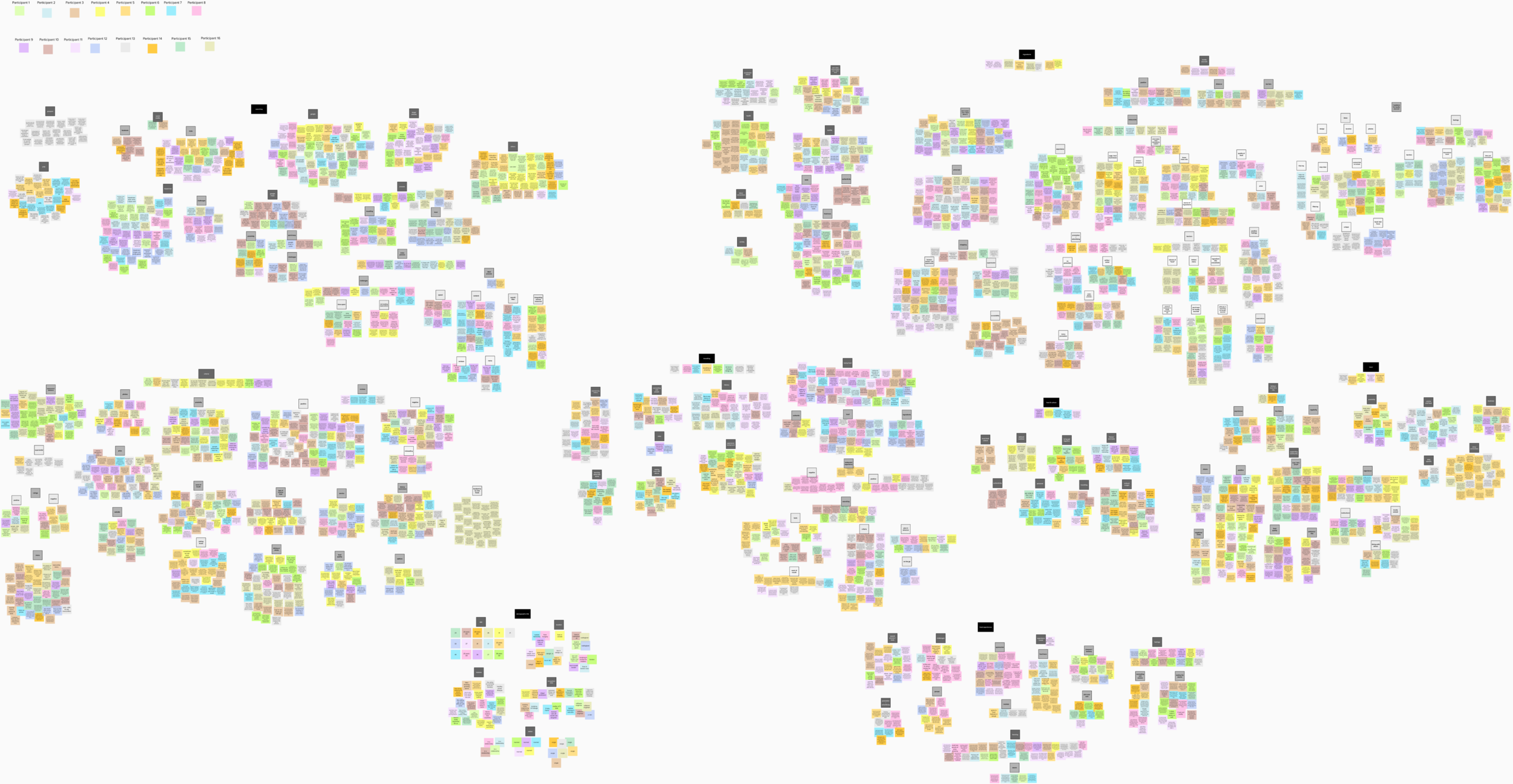
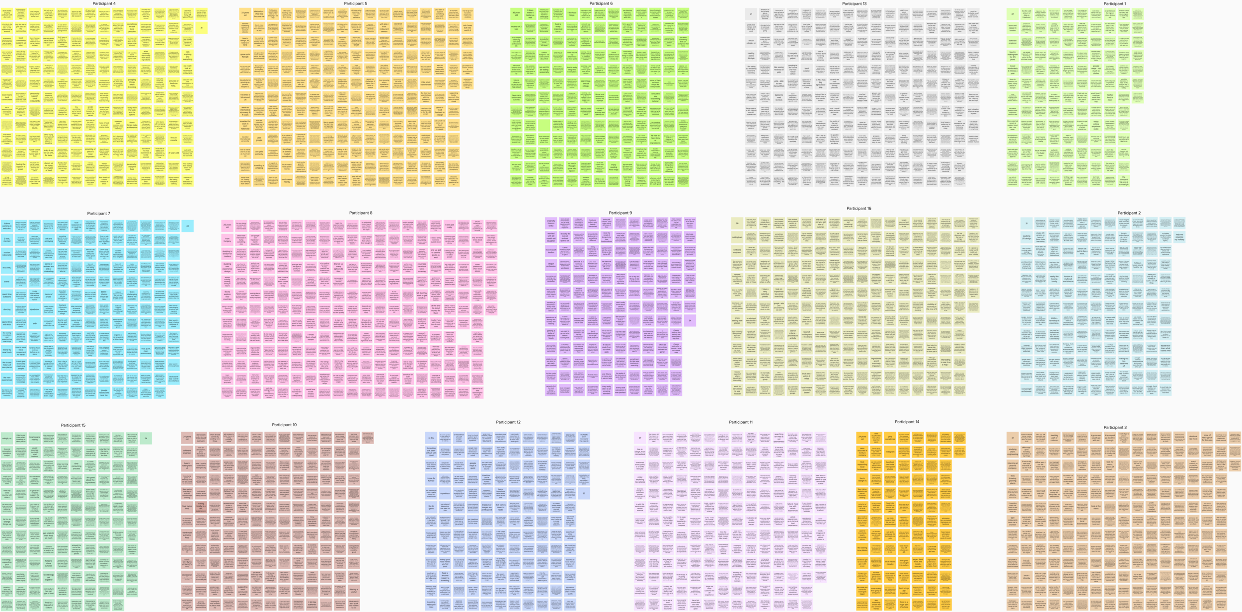
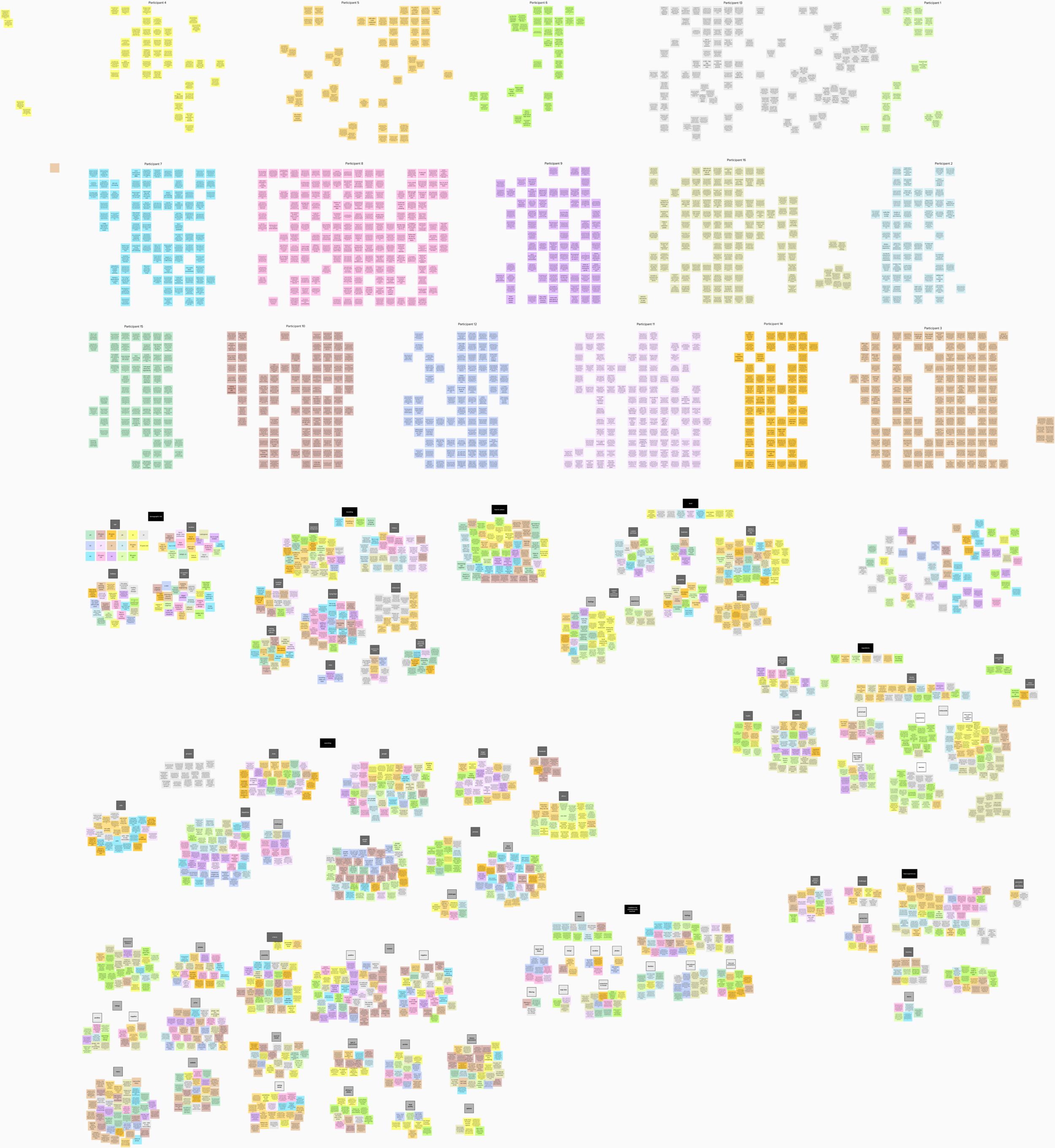
Affinity mapping was used to organise key information, phrases, quotes, and sentiments from the interviews and extract key themes between users. I revisited the map over the course of a few days, which helped to refine and clarify the themes to reflect more accurate findings.
Key Findings
The affinity mapping revealed 7 overarching themes and numerous sub-themes. The themes show commonalities between users’ sentiments and capture the connections within data that will ultimately inform the creation of the key features.
I then evaluated the key insights from 70-100% of users based on both the interviews and questionnaire. The findings with the most opportunity are described below.
User Personas & Journeys
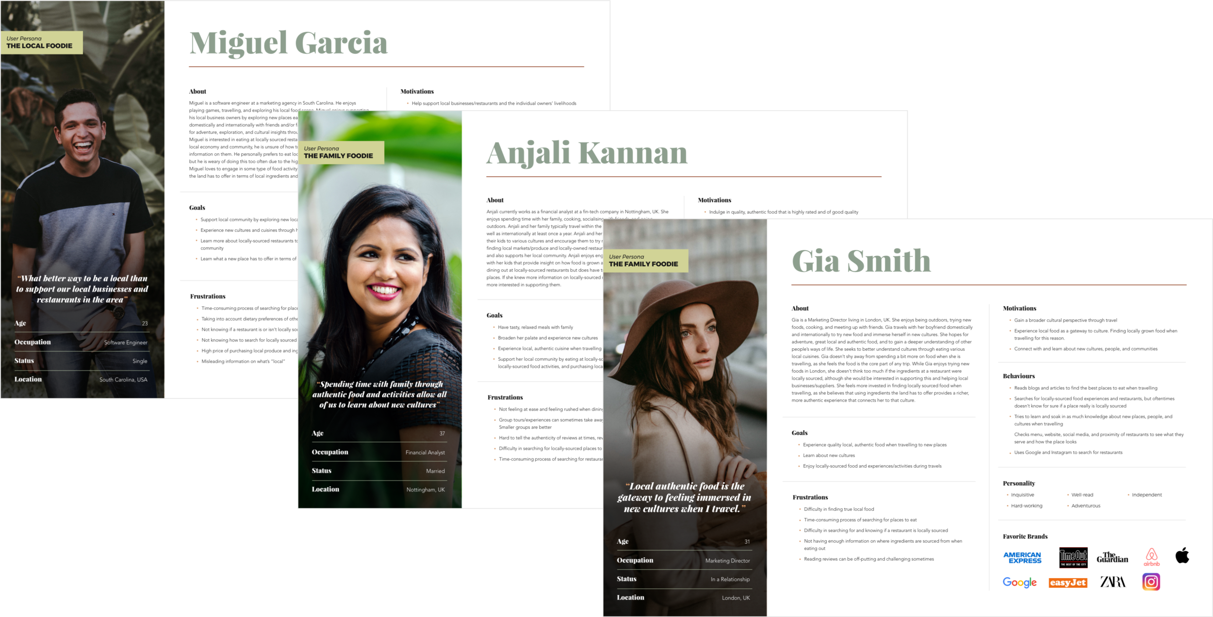
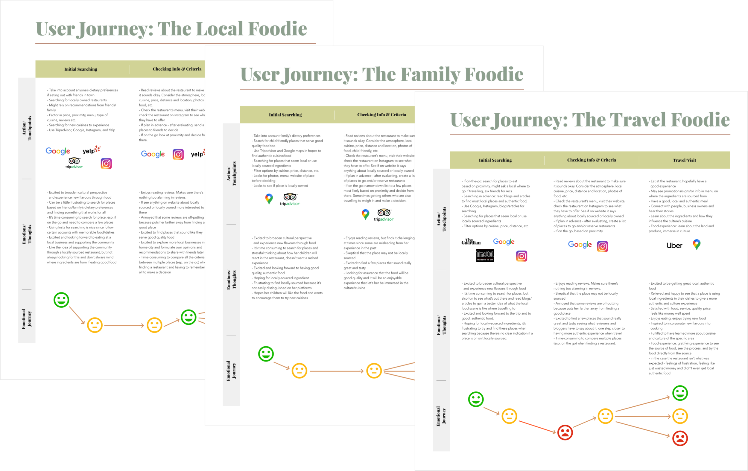
The accumulation of the user research and key findings led to the creation of 3 user personas and their respective journey maps. The personas are a direct reflection of the collected data and showcase different types of users and their goals, frustrations, motivations, behaviours, and personality.
The journey maps follow each persona’s unique journey of searching for a restaurant and maps their actions, emotions, behaviours, and feelings during this process.
Ideation
Problem Statement
With the data analysed, I created a problem statement that reflects the user, their need(s), and the insights gained from user research. This foundational statement helps establish a direction for the project and guide the ideation of key features.
“How Might We..?” Exercise
I used the “How Might We…?” brainstorming technique to break apart and reframe the problem statement as questions. These questions were then used to brainstorm ideas, which generated many different solutions.
I chose this brainstorming technique as it allowed for an efficient ideation session with a new perspective of viewing the problem and finding solutions.
Key Features
After thorough analysis and prioritisation of the brainstormed ideas, I generated 9 key features for the Roots app. The extracted features align with the sentiments expressed by the majority of users and will essentially translate to the core functionalities and design the app offers.
Branding
After brainstorming possible names for the app, I chose “Roots” as it signifies deep cultural ties that are embedded within various global communities, especially when it comes to food.
The word “roots” is also tied to plants and produce, therefore making it relatable to both these key aspects that reflect the goal of the app.
Roots combines a soft, earth-tone colour palette with a spirited serif font and a rounded sans serif font to evoke a grounded, healthy, and warm sense that many users resonated with when trying new food, connecting with cultures, and being immersed in authentic and memorable food experiences.
I conducted a brainstorm session for the logo design that emphasised the app’s connection to locally-grown ingredients and asked users to vote on their favourite options, which led to the creation of the current logo.
UI Design Rationale
Roots strives for a clean, simple, and structured UI design that emphasises beautiful food, ingredients, and cultures to stay true to the project goals. Inspiration was taken from apps that users enjoy using to create a sense of familiarity while standing out from competitors with a fresh take on the content and visual styling.
I also evaluated current trends for the UI design of restaurants and food searching apps to gain inspiration, and I incorporated UI design best practices such as clear hierarchy of information; consistent styling of components and actions; strategic usage of colour; principles of spacing & grouping; intuitive navigation; and system status feedback.
Prototyping
User Flow Diagram
Keeping the key features in mind, I constructed a user flow diagram that accounts for the different pages, decisions, and actions a user will navigate through when using the app. The pages are marked by rectangles, decisions by diamonds, and actions by circles.
This diagram helped define the majority of the page types needed for design and explored the logical flow of information within the application as a starting point. I used this diagram as a foundation to build on in the prototyping phase.
Initial Concepts
I started prototyping by creating quick and simple sketches before taking these to a digital layout. This allowed me to explore the structural foundation for the app in this early stage instead of getting carried away with details in imagery, typography, and colours, which would be explored in later iterations of designs.
Low-fidelity Prototype
The sketches were translated digitally in Figma to create a low-fidelity interactive prototype. I explored the layout of dietary preferences, onboarding screens, navigation bars, and search functionalities on the app.
In addition, I refined the content and placement of components for a more logical flow of information, such as establishing separate search pages for restaurants and food activities.
I kept this iteration less detailed to minimise investing time into a design before getting users’ input.
Mid-fidelity Prototype
In this iteration, I explored colours, typography, imagery, and interactions to bring the Roots brand to life. In addition, I built out more screens to show the sequences/processes established in the user flow diagram such as making a reservation, filtering options, searching via map, and reading information about individual restaurants.
High-fidelity Prototype
In this iteration, I finished building out all the remaining screens of the app, refined components and visual styles, restructured content, and refined key processes.
I realised that the user flow diagram proved to be more high-level since more detailed steps and paths of action were organically uncovered that were not originally accounted for. Designing for almost all of the possible actions that users can take within the app was a challenge, but this better prepared me for what to expect when creating a holistic prototype in the future.
Creating an Account & Onboarding
Dietary preferences generate personalised content and recommendations within the app
Onboarding screens emphasise key aspects of the app like searching for restaurants & food-related activities globally, supporting the local community, and connecting with cultures
Searching for Restaurants & Food-Related Activities
Find locally-sourced restaurants and connect with local suppliers through activities
View new local businesses & suppliers, personalised recommendations, best cultural experiences, and suppliers of the week
Streamlined searching with intuitive map view, detailed filter/sort options, and recommended search content
Restaurant & Food Activity Pages
Transparency of where local suppliers distribute their products and where restaurants source their ingredients
View cultural insights from restaurants & information on different cuisines and culinary traditions
Get to know chefs or owners of restaurants and suppliers
View menu, photos, and detailed reviews & ratings
Writing a Review & Adding a Photo
Review process ensures accuracy with categorised ratings for price, quality of food, ambience, service, cultural experience, and authenticity
Gain Inspiration & Connect with Friends
See what friends are posting about to get inspired for your next food experience
“Discover” feed is tailored to the user’s preferences
Read articles on all things locally-sourced
Create a Trip & Organise Food Experiences
Manage trip reservations and experiences for locally-sourced restaurants & food activities when travelling
Add friends to collaborate during trip planning
Usability Testing
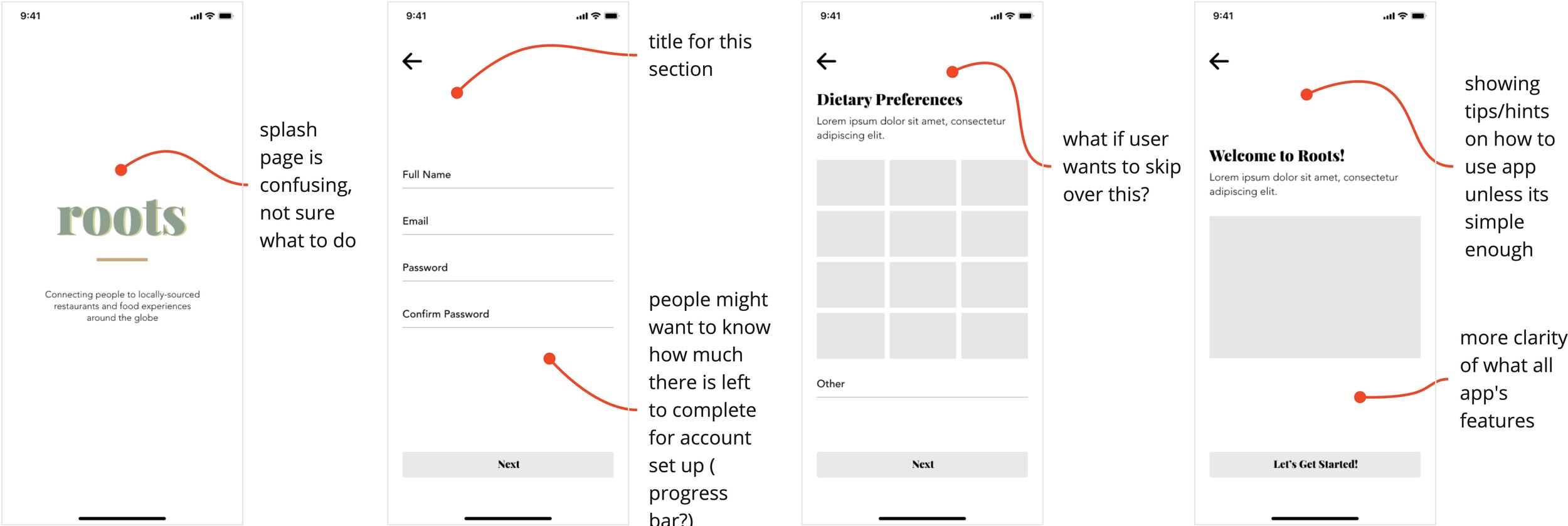
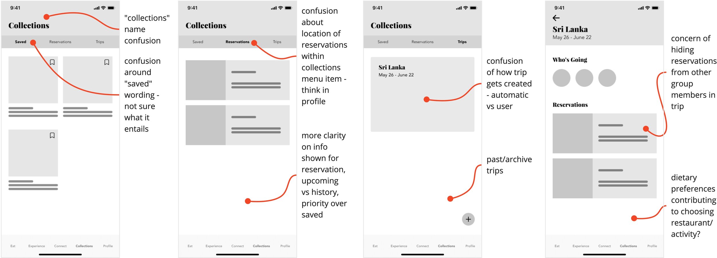
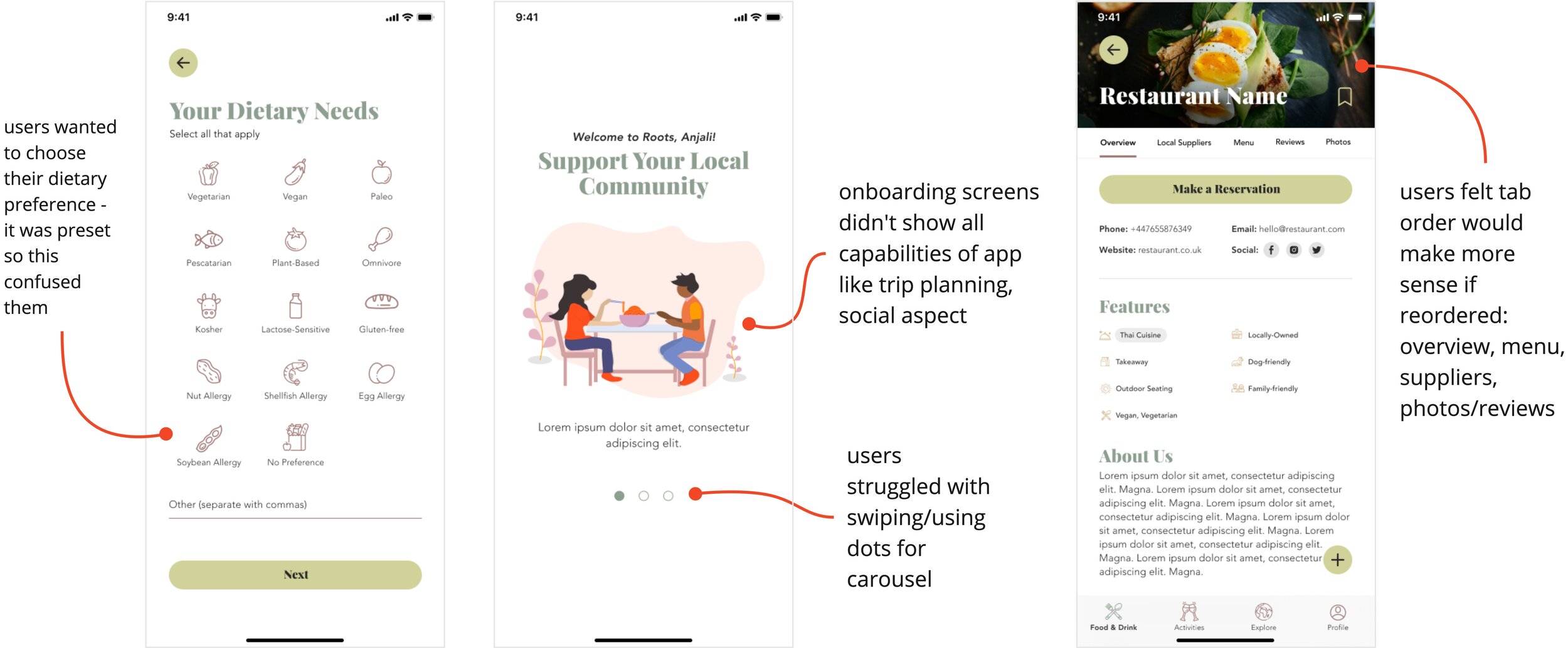
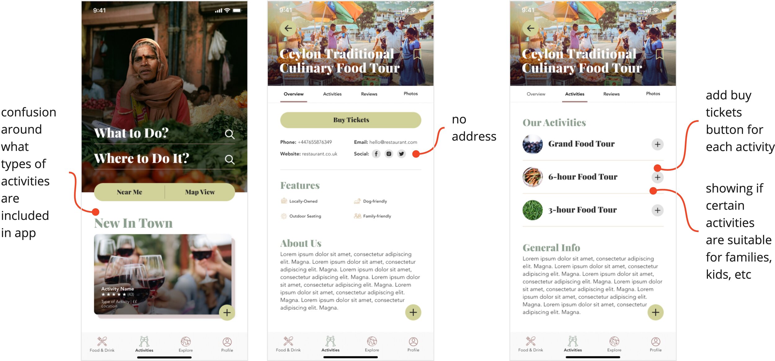
I conducted 2 rounds of usability testing, one to assess the low-fidelity prototype and another for the mid-fidelity prototype. I asked users to perform tasks that aligned with the key features such as searching for a restaurant/food activity. I used affinity mapping to create themes within the user feedback and better visualise the data.
The insights from testing revealed key usability issues around search functionalities, layout and content of restaurant pages, labelling of content, and the onboarding process that were amended in the following prototype iteration.
Testing allowed for a more collaborative approach by bringing users into design decisions early and incorporating their raw feedback.
Reflection
Overall, this project has achieved its goals and users expressed excitement and enthusiasm when interacting with the Roots app. A few key points of reflection from this project include:
Collaboration within an individual conceptual project is valuable and important. While this was a solo project, getting feedback from colleagues, peers, and users throughout all phases of the design thinking process revealed new perspectives and ideas I would not have otherwise explored.
This is a good reminder to not be siloed in my work and connect with others to discover new insights.
Budget and resources can greatly impact a project’s scope but provides high potential for the future. With higher investment, Roots can expand its offerings to Android devices and responsive web design for a more cohesive offering across multiple platforms, explore more sentiments expressed by users from interviews, and recruit participants that are fully representative of the target demographic.
Conducting and analysing user interviews & usability tests yields is a highly valuable experience. Directly engaging with users allowed me to empathise with them better and realise the importance of a user-centred approach to design.
While this project could have benefitted from more testing, the rich qualitative data I was able to work with revealed deeper and more accurate findings for a stronger end product.
Working within constraints boosts creativity. With COVID19 raging throughout the course of this project and restrictions in place, I relied on video conferencing software to conduct remote interviews and usability tests.
While interviews with locally-sourced restaurant owners were unable to happen, I was able to use secondary research to try and make up for these perspectives.


