Overview
The augmented reality (AR) market is expected to grow by billions in years to come, and the accessibility of AR provides many opportunities in helping users with day-to-day tasks.
This project uses the 5 phases of the design thinking process (research, analysis, ideation, prototyping, and testing) to create an iOS mobile app that supports users looking to furnish or decorate their space with items from a variety of home brands that suit their personal preferences.
Dwell will help users efficiently visualise and arrange these items within their space.
The Challenge
Users find it difficult to visualise how furniture will look in their home, which can contribute to stress and confusion when designing a space. With the amount of criteria users must consider when decorating a space such as accurate measurements, pairing of items, suitability of items to personal taste, designing a space can be burdensome.
The lack of a platform to support users in these endeavours points to an opportunity in the market.
The Solution
I designed an iOS mobile app called Dwell that will use AR technology to automatically integrate furniture and decor into a user’s space based on their personal preferences (ex. style, budget, type of space, etc.) and help better visualise items in relation to others in the space.
Dwell generates items into a user’s space, allows for interaction with objects in real-time, and offers a wide product variety from numerous home brands for a seamless design experience from the comfort of your home.
Company
Conceptual Project
Project Duration
10 weeks
Role
User interface design, user & market research, usability testing, research analysis, ideation, information architecture, and prototyping
Tools
Adobe XD, Mural, FlowMapp, Zoom
Methodology
I adapted the Hasso-Plattner Institute of Design at Stanford’s design thinking process, which consists of 5 phases: research, define/analysis, ideation, prototyping, and testing & evaluation.
Due to the iterative nature of design thinking, I found this process extremely valuable in discovering insights and informing key decisions for the app.
Market Research
Competitor Analysis
I conducted a competitor analysis of 4 iOS apps that use AR to view furniture and decor in your space. This provided insight into what is currently happening in the market, what capabilities these other apps have, and how Dwell can stand out in the market while also learning from competitors.
The biggest takeaways from the analysis are that while these apps provide very useful features and an overall clean usage of AR, none of them are capable of automatically conducting a complete redesign of a space based on the user’s personal preferences, which is the core focus of Dwell.
User Research
Since AR is predominantly used by those aged 16 to 34, this informed the target demographic for the Dwell app.
I conducted 5 semi-structured user interviews to collect rich, qualitative data in order to better understand the process users took to shop for home decor/furniture and decorate their living space.
I sent a follow-up questionnaire to users to validate the collected data and gain a more holistic view of their perspectives.
Analysis
Affinity Mapping
I transcribed each interview and conducted a thematic analysis before grouping key information into themes using affinity mapping.
This allowed me to better visualise the data, have an accurate depiction of where users’ sentiments lied, and empathise better with users to inform design decisions.
Key Findings
The affinity mapping revealed 5 themes and numerous respective sub-themes. The themes captured connections within the data that hold importance to users, which will ultimately inform the creation of the key features for the app.
In addition, I evaluated the key insights from 5/5 and 4/5 of participants to see what most users resonated with, which allowed me to prioritise the types of functionalities and content that need to be included in the design of the app.
User Personas & Journeys
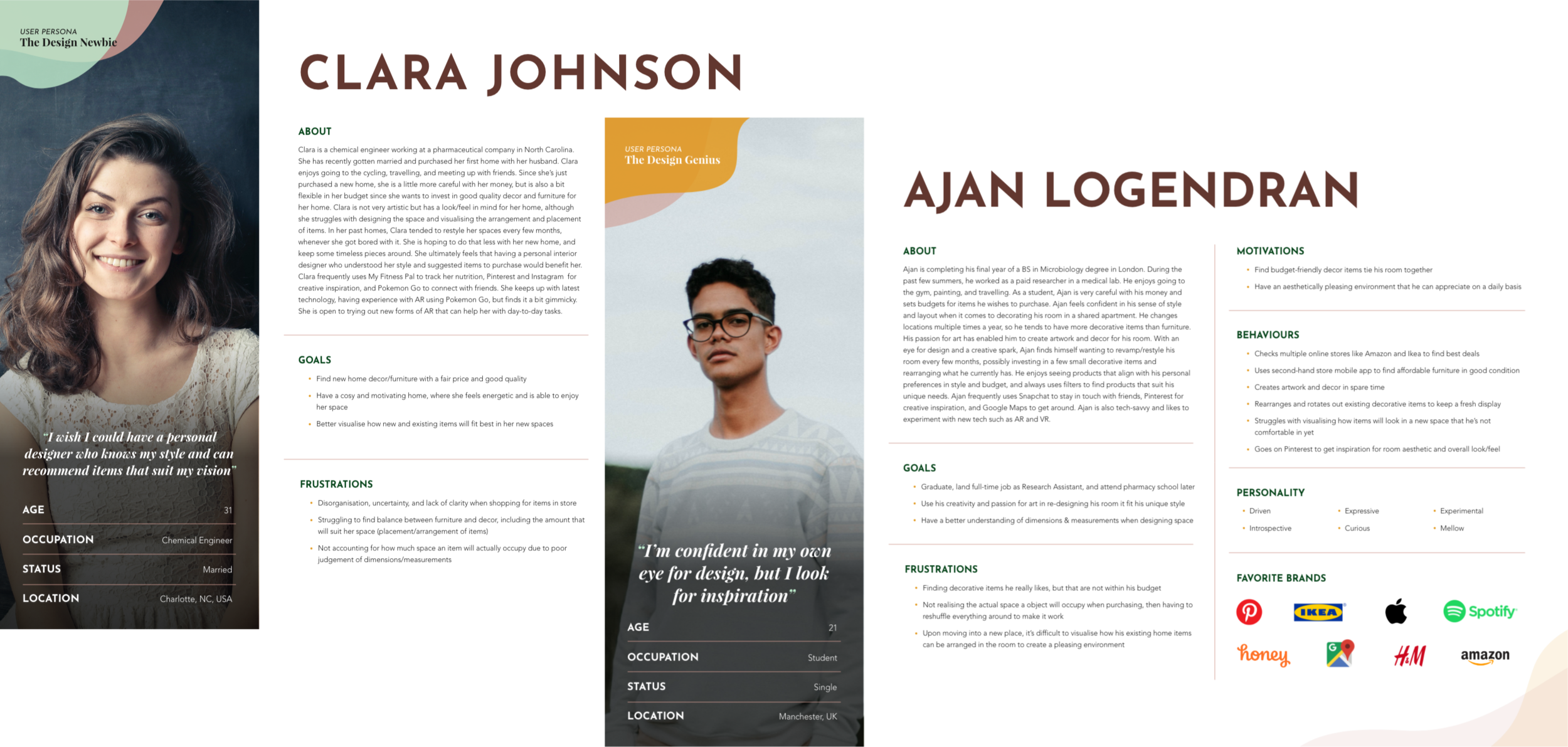
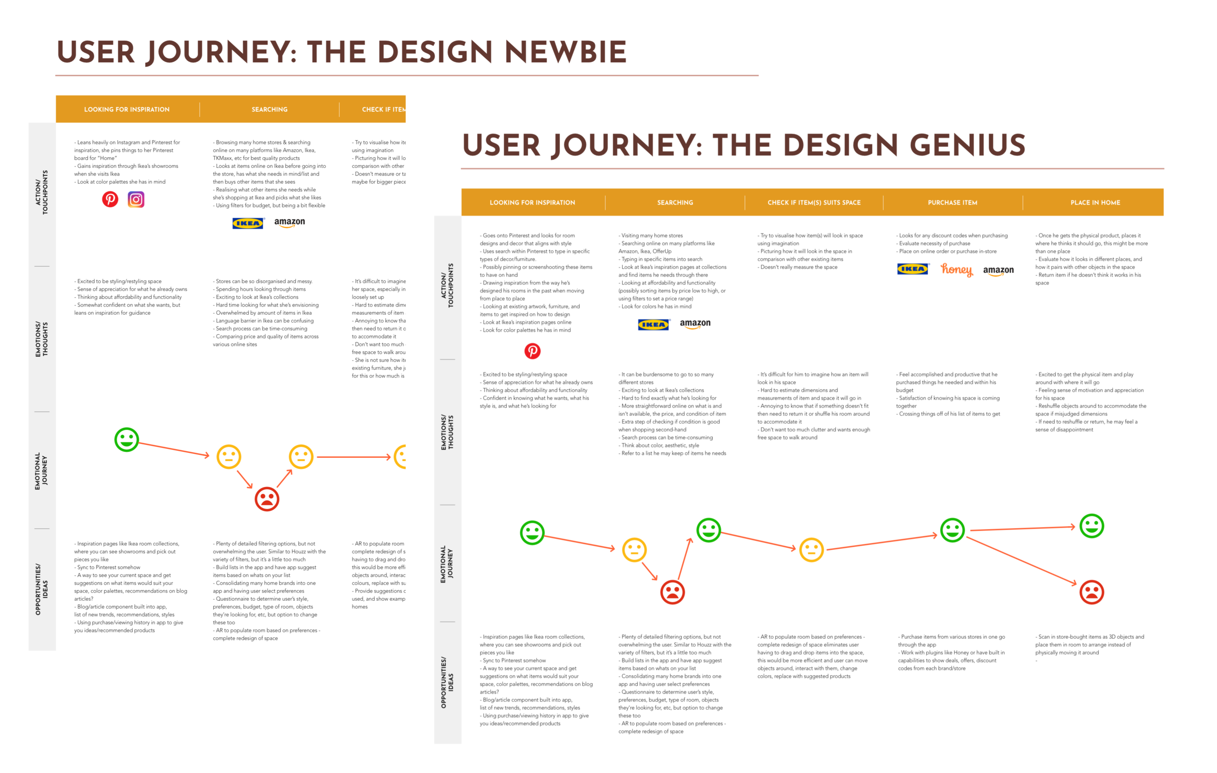
I created 2 user personas and journey maps based on the key takeaways from the thematic analysis and affinity mapping. The personas directly reflect the gathered data and showcase various user types and their goals, frustrations, motivations, behaviours, and personality.
The journey maps follow each persona’s process from searching for a piece of home decor or furniture to ultimately purchasing it. Mapping the persona’s actions, emotions, behaviours, and feelings during this process helped me better empathise with users.


Ideation
Problem Statement
Using the analysed data, I created a problem statement to reflect the user’s need and the main insights from research. The problem statement helped anchor the project and guide the ideation session.
“How Might We..?” Exercise
I chose to use the “How Might We…?” brainstorming technique for the app’s key features as it allows for efficiency and brings a new perspective of viewing the problem. Essentially, I reframed the problem statement as questions to brainstorm solutions for.
This allowed me to focus on certain aspects of the problem statement and dig deeper to generate ideas.
Key Features
After analysing the brainstormed ideas and ensuring they aligned with the key research findings, I derived 6 key features for the Dwell app, which are targeted points that reflect what most users have expressed in regards to designing their interior space. These features will translate to the core functionalities of the app.
Branding
Earthy colours paired with clean, bold typography and soft overlapping shapes helps invoke a balance between warmth, structure, and imagination - all qualities a user feels during their search in designing their home.
The name “Dwell” alludes to the nature of home and comfort, which directly correlates to having a beautifully designed space that suits your personal taste.
Prototyping
With limited time and resources, a mid-fidelity prototype was the deliverable for this project, exploring in-depth the feature of using AR to automatically redesign a space based on personal preferences.
User Flow Diagram
With the key features in place, I created a user flow diagram that walks through various processes within the app such as onboarding and using the AR design functionality.
The diagram allowed me to really think through all the pages, decisions, and actions a user will explore on the app for each of these main processes. I was also able to determine a more logical flow of information within the app.
Low-fidelity Prototype
Using the user flow diagram, I created a low-fidelity interactive prototype that focused on the layout of the app and started to explore colours, imagery, and typography. Ideally, a larger screen allows the user to see more area of their space through the camera. Therefore, I prototyped the app on a tablet.
I built out a rough design for the preferences quiz as part of onboarding that captures a user’s sense of style, budget, living situation, etc. From this, I mocked up the AR design space which will automatically generate objects based on the inputted preferences when a user scans a room using their phone or tablet camera.
I also explored how a user can save a designed room, view their profile, and view an inspiration feed. Keeping this iteration less detailed allowed me to minimise investing time into a design before getting users’ input.
Some inspiration for the layout was drawn from apps that users enjoy using like Instagram and Pinterest to help bring a sense of familiarity to users when they use Dwell.
Mid-fidelity Prototype
I incorporated the feedback from usability testing into a mid-fidelity prototype and explored more details in the branding, functionality, and interactivity of the app. Realistic content and imagery were worked into this iteration, and I enhanced the content and layout for a better flow of information.
In addition, I refined the preferences quiz to be more personalised, developed a tutorial for how to use AR design mode, and explored various ways users can interact with items and design their space in a more customised way.
To use the app, the user will hold their phone or tablet over the area of their space they want to decorate/furnish and interact with the AR generated objects on their screen.
Preferences Quiz
Accurately tailor home items to your personal taste by completing a quiz
Preferences include type of space, budget, style, colours, types of items, and item quality
AR Design Mode Tutorial
A guided walkthrough on how to generate items in AR and interact with objects
Brief descriptions on various key functionalities like filters, shopping cart, and manually replacing items.
AR Design Mode & Functionalities
Simply tap a “Generate Items” button to automatically populate your space with AR objects
Directly add items from the room to your cart and save the full redesigned room to refer back to
Regenerate the room at any time with new items and lock items you like so they stay in place while other items get replaced
Manually add items to the room by searching or choosing from suggestions
Use filters to adjust price, style, colour, and item type
Select AR items in the room to view similar products and easily replace items
Explore, Saved, & Profile pages
View trending and recommended home items and designed rooms tailored to your personal preferences
Easily view your saved rooms, items, and inspiration from the Explore page
Usability Testing
1 round of usability testing with 3 participants was done to assess the low-fidelity prototype, asking users to perform tasks around creating an account, using AR to design their space, interacting with items, and saving the designed room.
The testing yielded many insights that revealed key usability issues with refining the preferences quiz, labelling of content, and making AR design mode more intuitive. Testing allowed me to better empathise with users while they interacted directly with prototype, develop a more collaborative approach to building a product, and uncover usability issues from a different perspective.
Reflection
Overall, this project has achieved its goals and users expressed excitement and enthusiasm when interacting with the Roots app.
A few key points of reflection from this project include:
Design thinking provides layers of insights. Especially during the research and usability testing phases, I was able to really see the iterative nature of design thinking. Engaging directly with users throughout multiple phases of the project process allowed me to stay consistent in empathising with my users and keeping them at the focal point of all design decisions.
Usability testing yields actionable feedback that inevitably builds a stronger product. The pinpointed feedback from users while they directly interact with the prototype is extremely valuable in evaluating what is and isn’t working.
Ideally, multiple rounds of usability testing would have provided validation for each prototype iteration once user feedback was incorporated, but having even a few key insights from users helped me get out of my head and empathise with how users were navigating the app.
While some of the feedback was unexpected, it provided a challenge to work within certain constraints and empowered me to find a way to create a user-friendly design.
Designing with limited resources and time can still make an impact. Since this project explores AR as an emerging technology and emphasises building out one core process of the app: automatically redesigning a space with items of personal preference, the time frame did not allow for extensive prototyping and usability testing.
However, I was able to create an AR experience without actually implementing true AR prototyping in the app by showing detailed screens and visuals that mimic this. Therefore, I learned that it is possible to use creativity to explain an idea and message for a more complex project even without the appropriate time or resources.


