

Overview
A gap in the content creation market revealed a need for financial experts to easily share, analyse, and monetize their financial insights.
With Tellimer’s established presence as a fin-tech company distributing financial insights on emerging markets, we set out to create a creator stack tailored specifically to financial experts looking to build their own businesses by sharing their insights with an audience.
We used Tellimer’s internal tool that our team of analysts use to share insights as a foundation to build the app.
Project Goals
Create an intuitive, easy-to-use content editor to publish posts and be discovered in various financial markets
Provide multi-channel analytics to inform users of readership
Create a seamless monetisation of content between readers and creators
Company
Tellimer
Project Duration (for MVP)
5 months
Role
UI/UX Designer: design thinking, user & market research, usability testing, research analysis, ideation, information architecture, prototyping, branding, visual design
Tools
Figma, UserInterviews, Design sprint methodology
*This was a collaborative project done with the UX Design team
Research
Competitor Analysis
Competitors in the market were evaluated by the internal stakeholders. Competitors include Ghost, Substack, Revue, Patreon, and Medium. After reviewing the competitors' features, the team created a list of features we felt were necessary for our product.
Some takeaways from the competitors are they:
lack a clear focus on targeting financial writers
don’t allow for customisation
weren’t intuitive, user-friendly
lack robust features/integrations


For the post-scheduling feature within Scriber, I evaluated publishing platforms like Squarespace, Ghost, Medium, Wordpress, and Substack for how they navigate scheduling and rescheduling a post. This allowed for a close inspection of common conventions and patterns, along with sparking inspiration for how to handle Scriber’s flow for post scheduling.


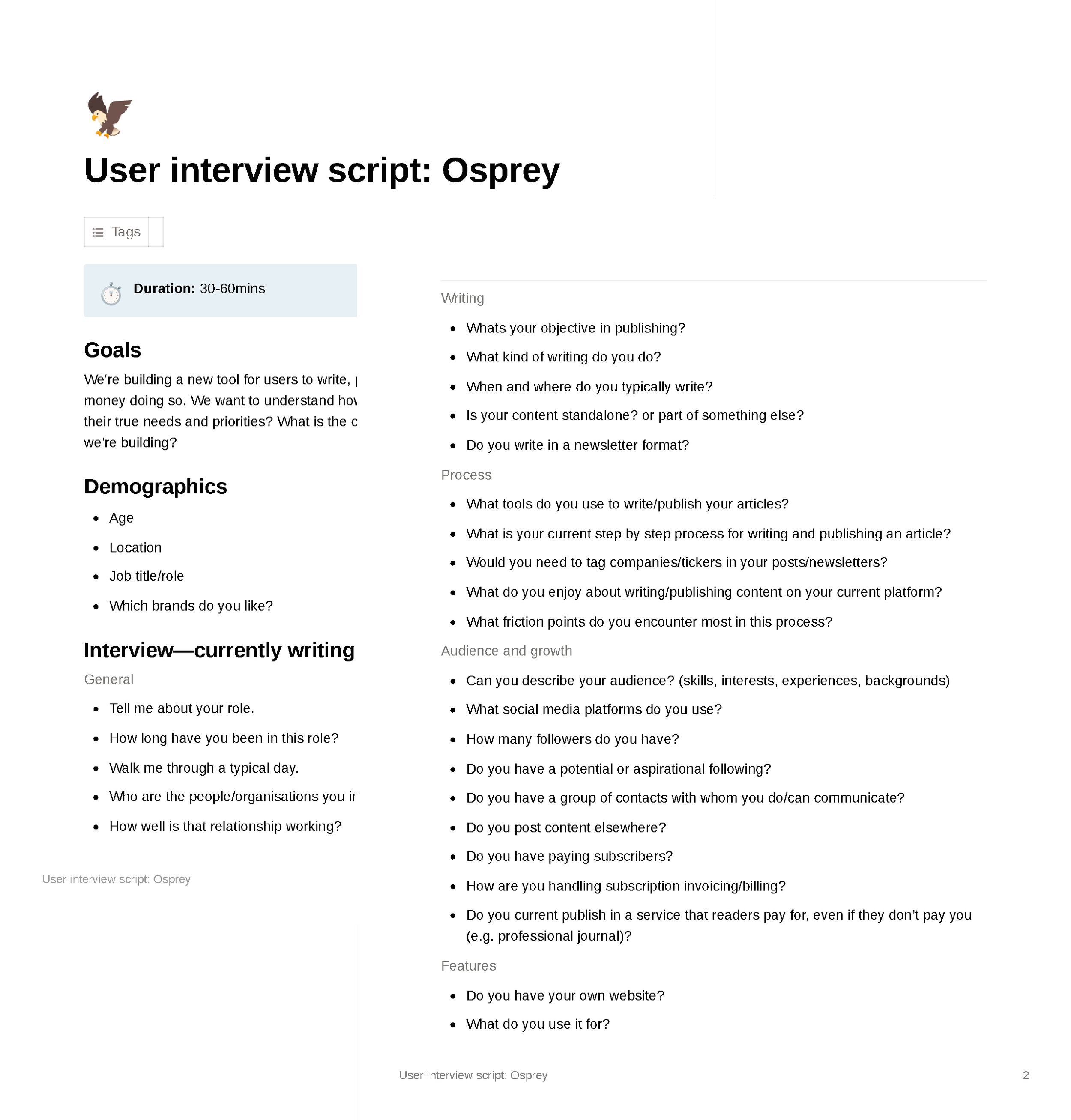
User Research
We conducted 10 interviews with writers to gain deeper insights of how users were currently writing and/or publishing content. Of these 10 writers, 4 were financial writers.
I organised and scheduled the interview sessions with participants using a tool called UserInterviews.com, a service that provided us with our specific criteria for recruitment.
*Note: We named the product “Osprey” as a placeholder until we decided on a name later in the design process.
Analysis
Affinity Mapping
We extracted key data from the interviews and used many iterations of affinity mapping to see patterns and themes amongst all the users.
Following are a few of the key findings separated out by the financial writers, non-financial writers, and all writers together:
Of the financial writers, most:
write about multi-assets & global macro
showed some reluctance towards social media
value readership analytics highly
are already well-regarded in their field
Of the non-financial writers, most:
have an existing pool of contacts
enjoy writing but also found it challenging
have an established process for writing
use LinkedIn as their primary social
Out of all the writers, most:
feel that tagging companies/tickers would be useful
often used charts as a starting point for their article
find templates to be beneficial
want greater formatting & styling options
are prepared to work to grow their audience
enjoy making an impact through their writing
distributed their work through many different channels


User Personas
Based on the key findings, 3 user personas were created: a former sell-side analyst, an IRP, and a crypto writer (in progress).
Each persona’s goals, frustrations, motivations, behaviours, and personality are documented to better understand the users.
Ideation
Using the key findings, we progressed into various ideation sessions that spanned over the course of a few weeks. Brainstorm techniques included:
Question board
MoSCoW
Design Sprint
The Design Sprint methodology was used to bring the project team together to generate general product ideas and more specifically, to determine the design of Scriber’s dashboard and editor. This method called for rapid prototyping, efficiently helping us get to market faster.
We conducted 2 design sprints, the first one for developing initial product ideas, and the second for the product dashboard specifically.


We revisited and solidified the list of features for the product as well.

Prototyping & Testing
User flow Diagramming & Journey Mapping
We created a user flow diagram that follows the path a user will take to navigate the Scriber app from initial signing up to successful publishing. This diagram sets a guideline for the logical flow of information for this process and helps to inform the screens we need to prototype.


Wireframes
Using the user flow diagram, we created wireframes for all the page types dictated by the flows. The wireframes help create structural guidance as opposed to working with visual details too early on.
Low to Mid-Fidelity Prototype Iteration 1
Using Tellimer’s existing web UI components initially to work faster, we mocked up screens based on the wireframes. Before moving into high-fidelity screens, we created 3 low to mid-fidelity prototype iterations with usability testing for each.
In the first iteration, we focused on the sign-up and publishing processes:

To validate the designs, we conducted usability testing with 4 participants.
Test goals:
Sign up
Publish an article
Explore dashboard
Add content/use editor
Send a test email
Preview & publish article


Low to Mid-Fidelity Prototype Iterations 2 & 3
In the second and third iterations, we focused on the dashboard screens. We also implemented feedback from the first round of usability testing, fleshed out the sign-up process, and further explored the publishing process and editor screens.


Again, we validated these designs by conducting usability testing with 4-5 participants per iteration.
Test goals:
Sign up
Explore/view dashboard during account setup tasks
Explore/view the dashboard after publishing a post


Branding
Before moving onto high-fidelity screens, we worked with a third-party company to find a suitable name for the product. The name “Scriber” resonated well with everyone on the team and alluded to the platform's functionality for writers.
Next, we went through many explorations of the brand elements including colours, logo, font styles, and patterns. The final logo is reminiscent of a paper scroll and versatile enough to be used as a stand-alone mark. The brand colours are serious yet playful and the typeface is modern yet classic which stands out in comparison to Scriber’s competitors.
The brand elements work together to build a clean and welcoming platform for financial writers to enjoy using.


UI Library - Tailwind CSS
With the fast timeline for MVP launch, we decided to use Tailwind CSS’s UI component library to help streamline the prototyping process. The library housed an extensive list of components at our disposal, which we later applied the branding to.
Below is the documentation of the Tailwind components we used and how we applied the brand’s visual styling. This resulted in a more seamless handoff to engineers.

High-fidelity Prototype
This iteration was a culmination of all the user feedback from the previous 3 iterations. We built out all the remaining screens that we needed for the MVP launch, refined components and their states, and built out all the actions a user will be able to take to navigate through the app.
These high-fidelity designs went through many rounds of internal feedback that we implemented as well.
MVP prototype
Shows the basic flow of creating a new post, adding content, previewing, publishing, and viewing the dashboard
Post scheduling feature prototype
Shows the flow of scheduling a post for later
Next Steps
We will continue to iterate and test the product as we build out new features. Currently, the team is working on post-scheduling, interactive charts, tagging/tickers, and more control over payments. We have already conducted some testing sessions for a few of these features, and some will need to be built from the ground up.
Below is the testing feedback of Scriber from its MVP launch. This feedback was incorporated into the design by other team members who carried the project forward.
Questions for Scriber’s future
How might we ensure users are satisfied with Scriber as opposed to other publishing platforms they’ve had experience with or switched from?
It will be interesting to talk to users who have switched to Scriber from competitors like Ghost or Substack which are more well-known. This can help us learn about more opportunities in the market and validate the creation of Scriber.
How might we create a more accessible platform that's inclusive of all users?
While we strive to be Level AA compliant with our products, there’s always more we can do to make the product more inclusive. One exploration can be an accessibility toolbar on the homepage of Scriber’s website.
How might we open Scriber up to other types of users outside of financial writers?
While the goal is for Scriber to function as a creator stack for financial experts, eventually other users might be more drawn to it as well if we continue to practice UI/UX best practices for easy, intuitive publishing. It might be worth exploring what other subgroups to market Scriber to.